Advent Calendar
for Jæren Kaffi Glede
Packaging design
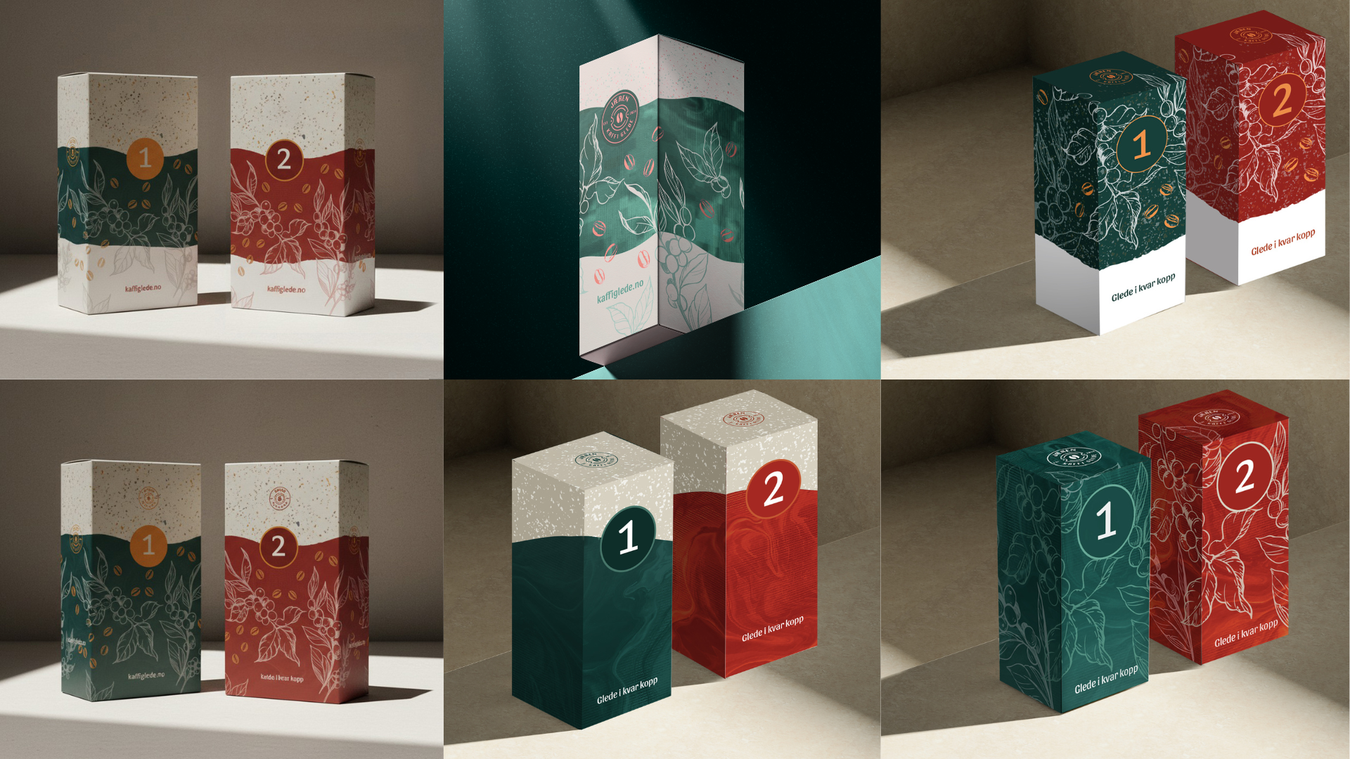
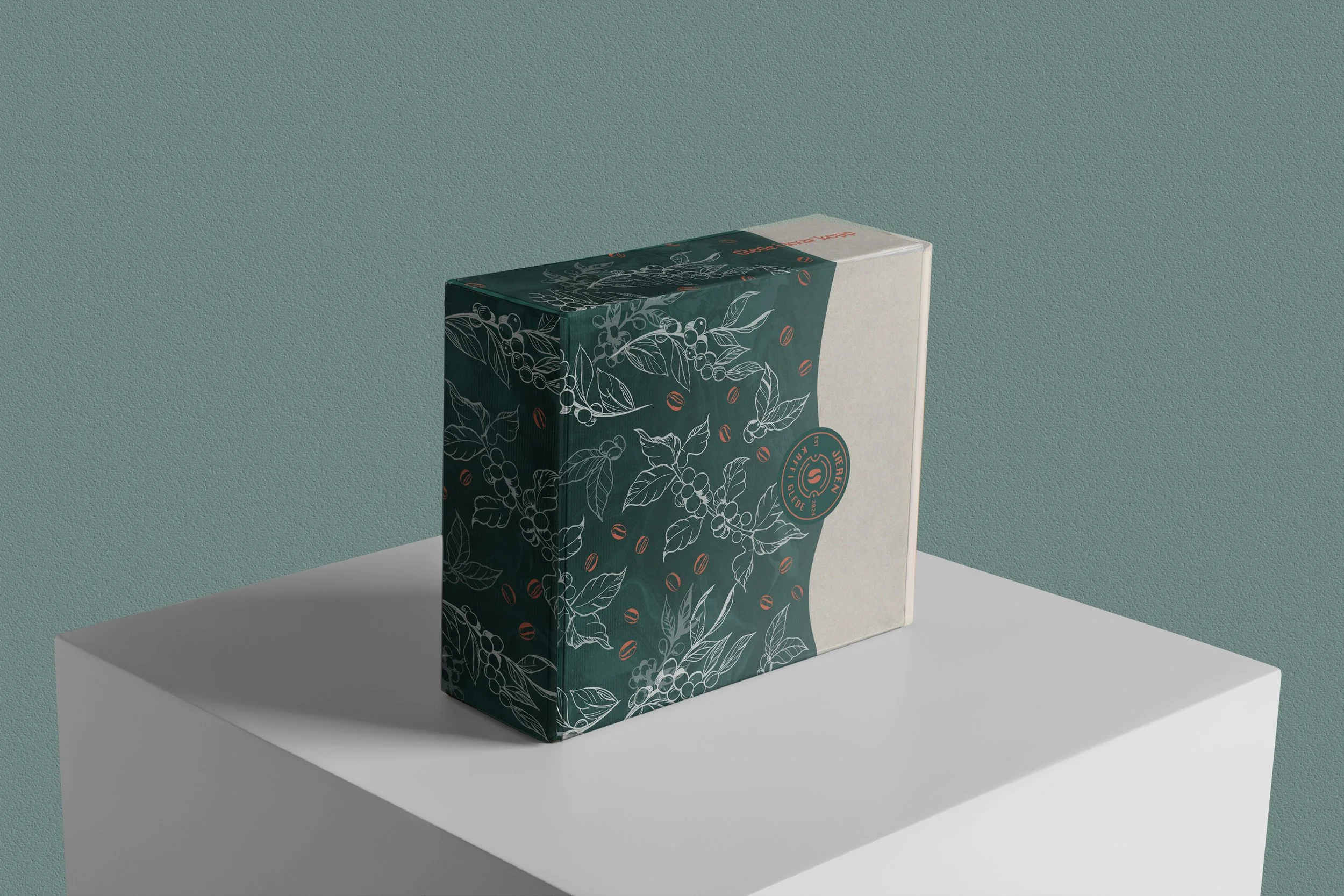
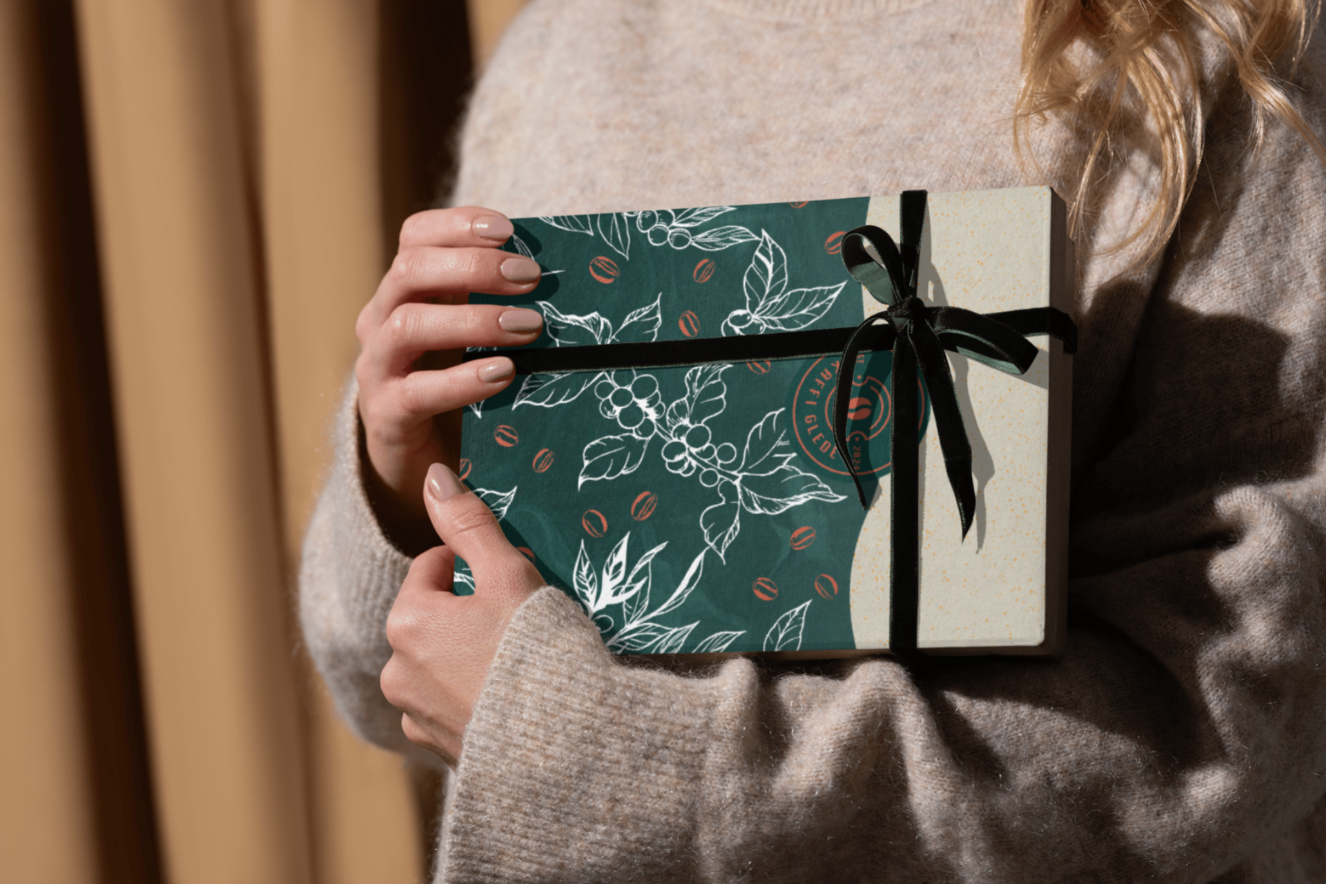
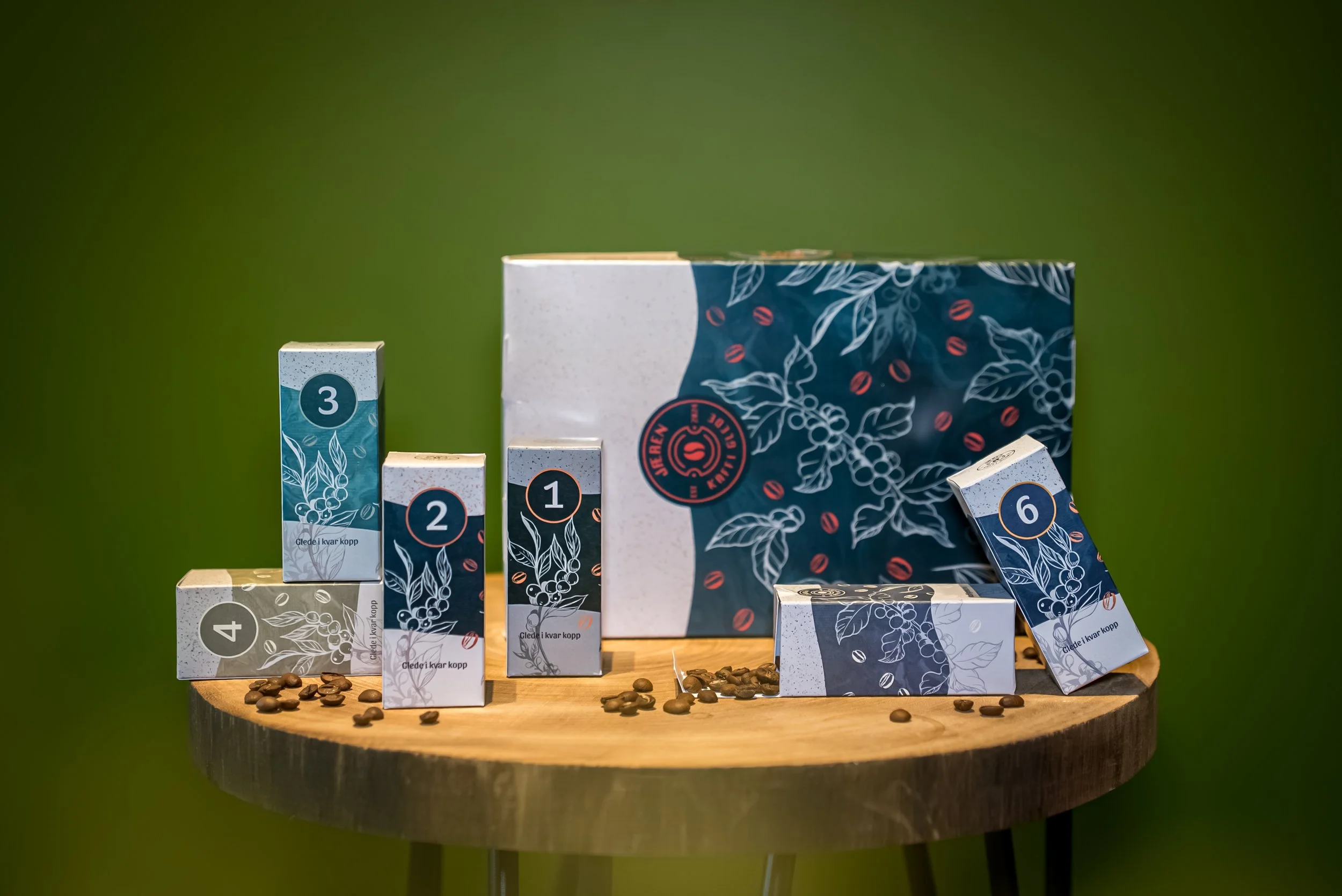
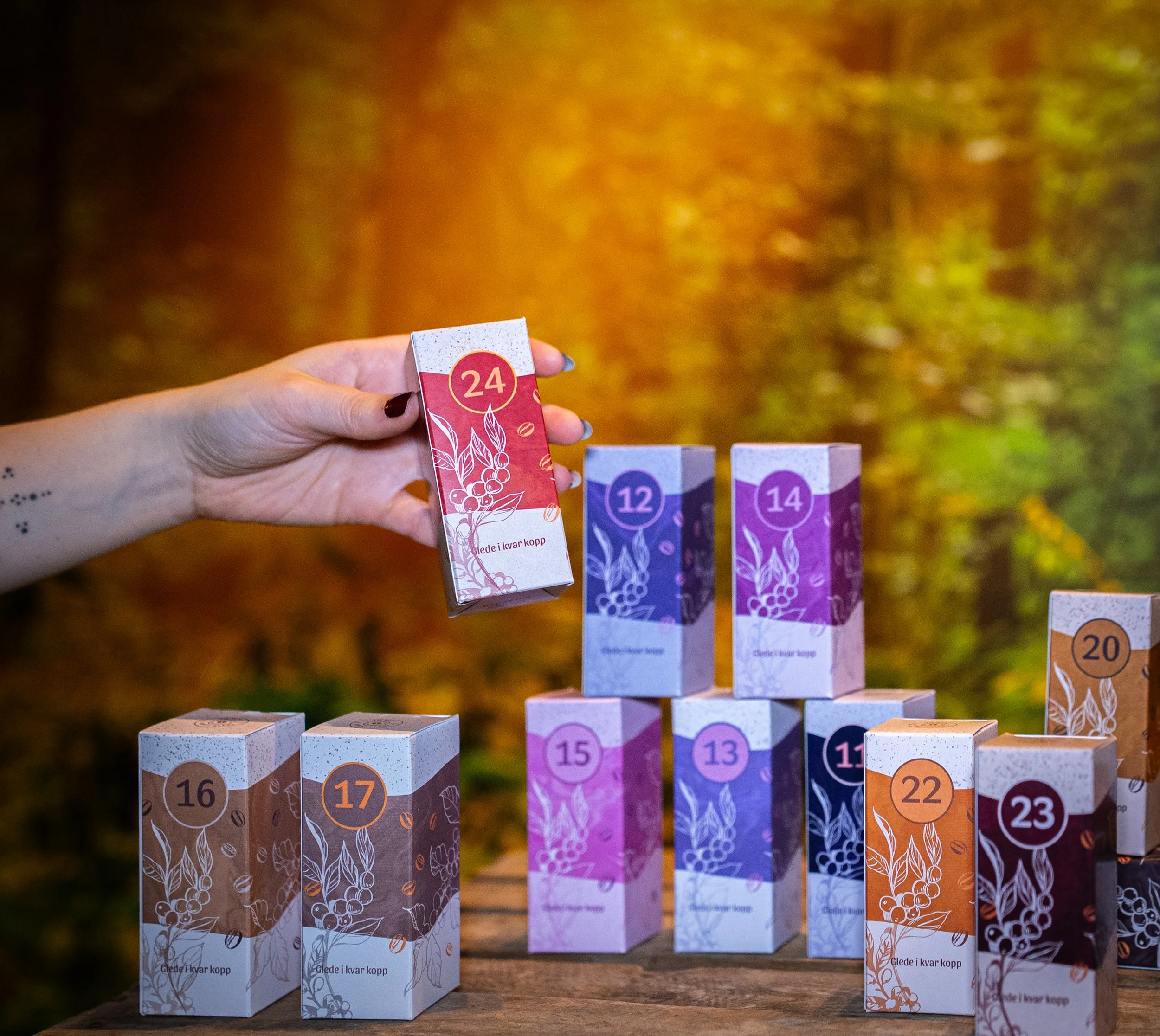
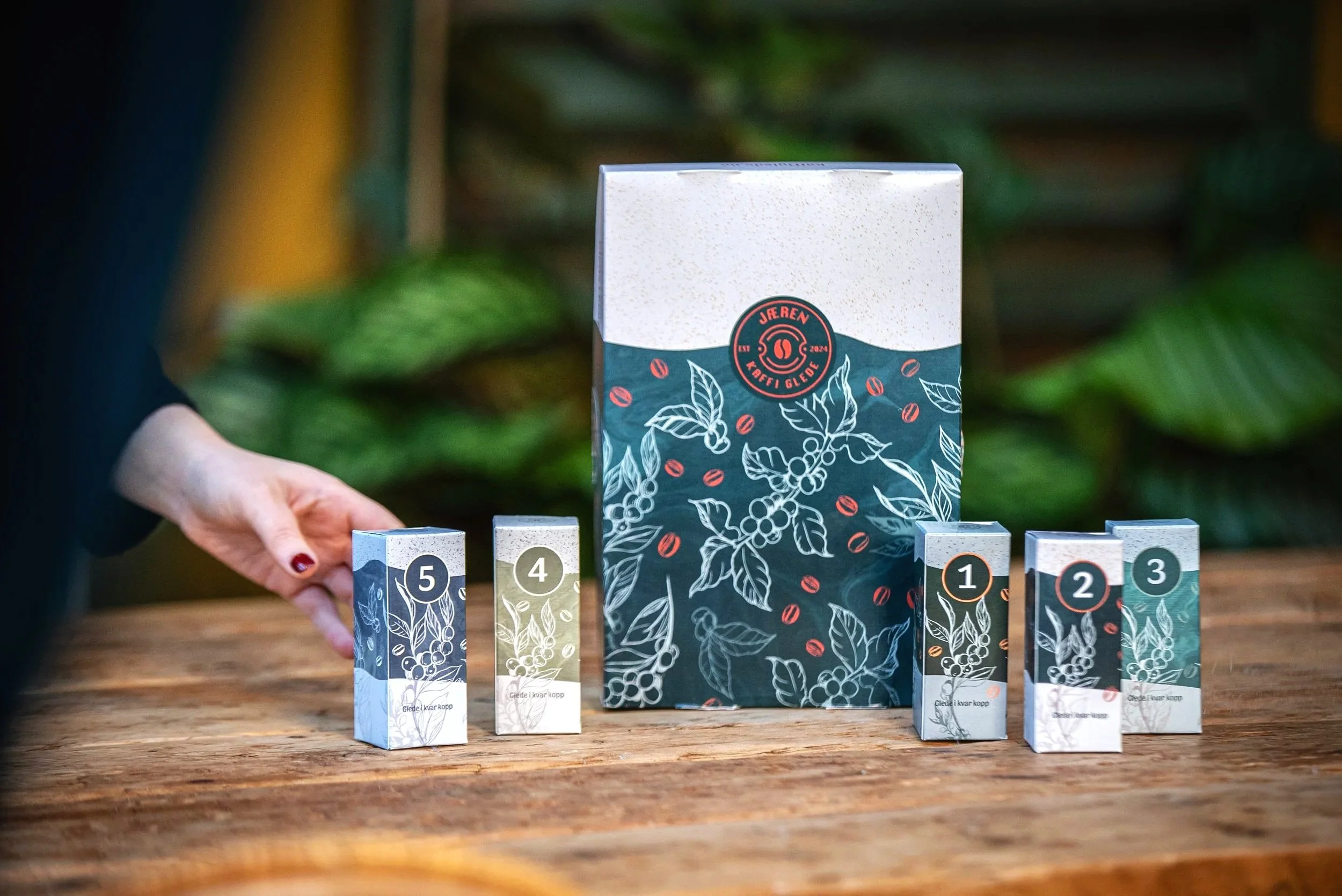
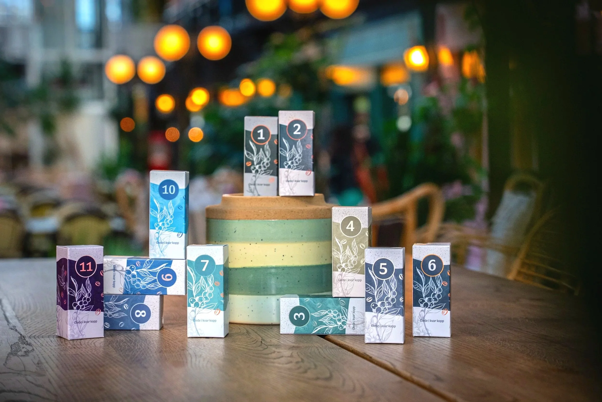
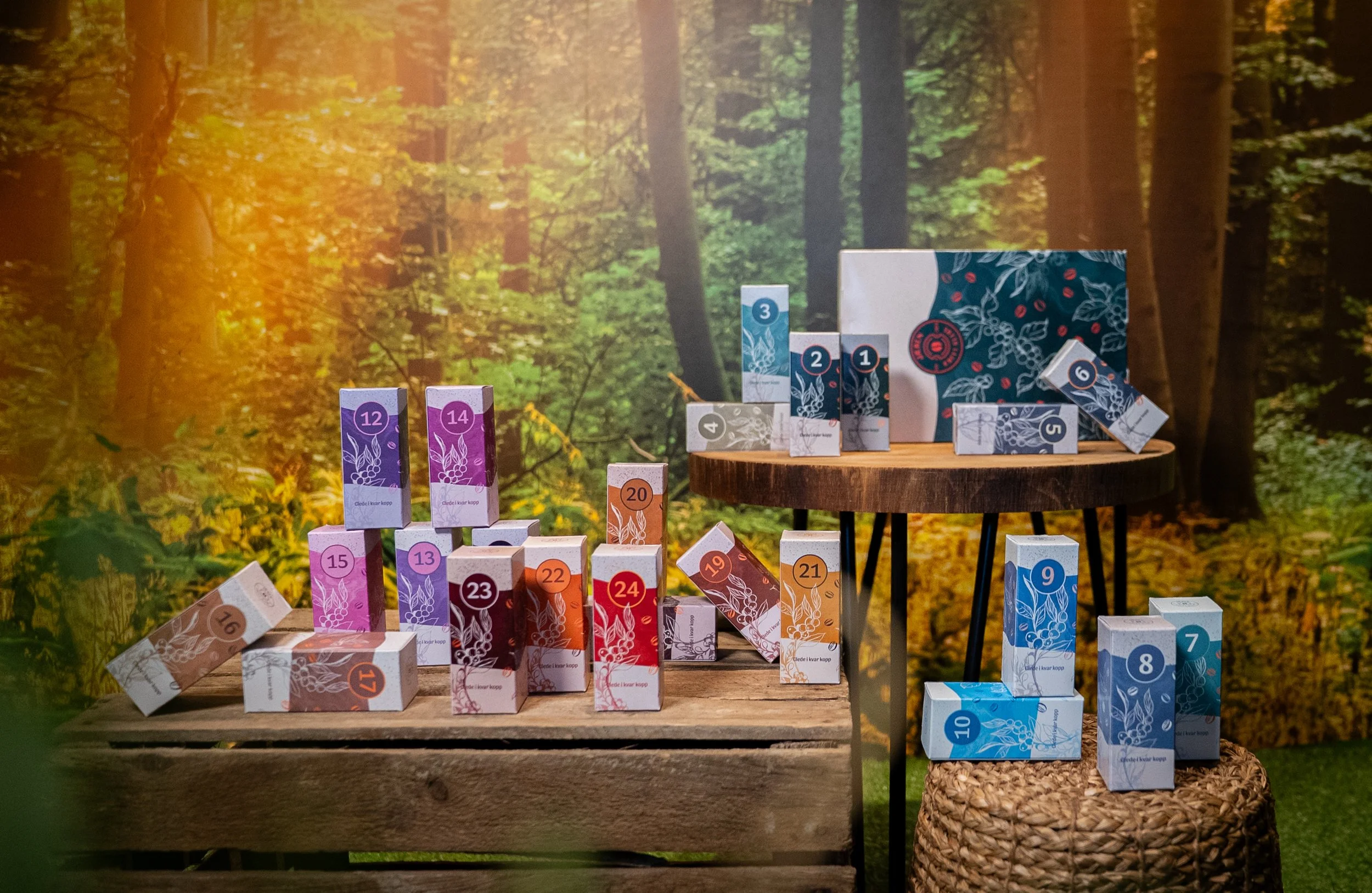
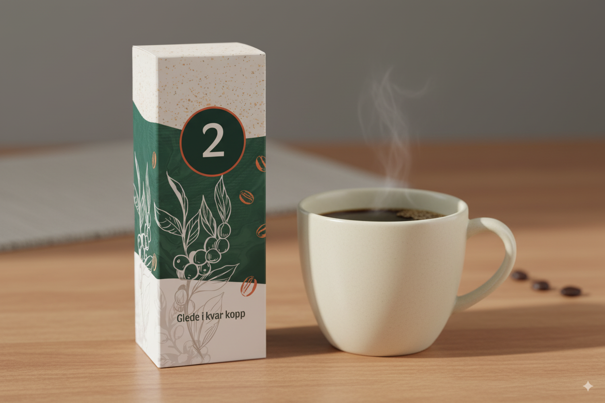
I was responsible for designing Jæren Kaffi Glede’s Advent calendar, consisting of a main box and 24 individual boxes. A key part of the brief was that each box should have its own unique identity while still contributing to a cohesive overall design.
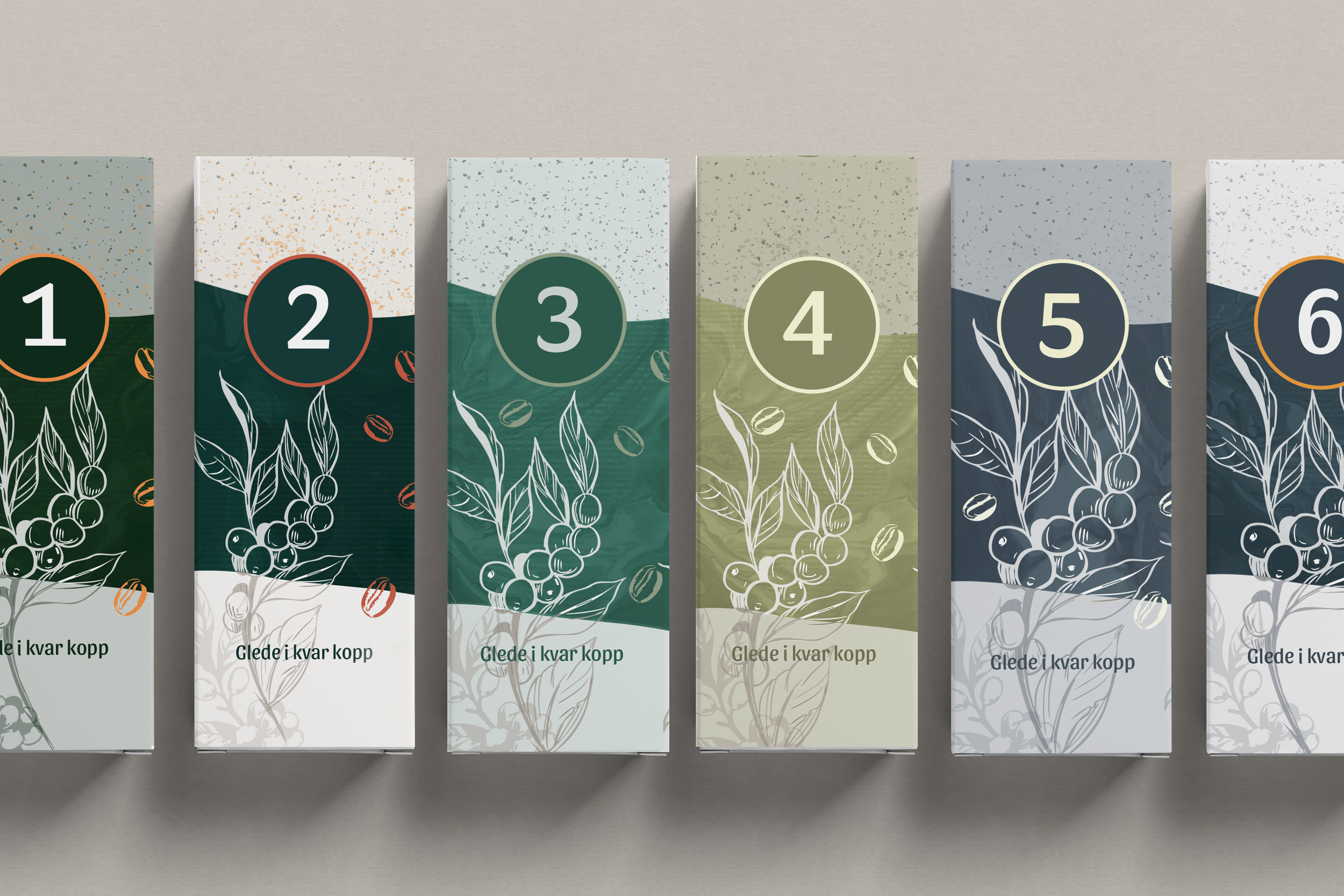
To achieve this, I developed a flexible design system in which all boxes share the same visual language but feature individual color combinations. The color palette gradually transitions from cool winter tones to warmer Christmas-inspired hues as the days progress toward Christmas Eve. This creates a visual countdown that builds anticipation throughout the Advent season.
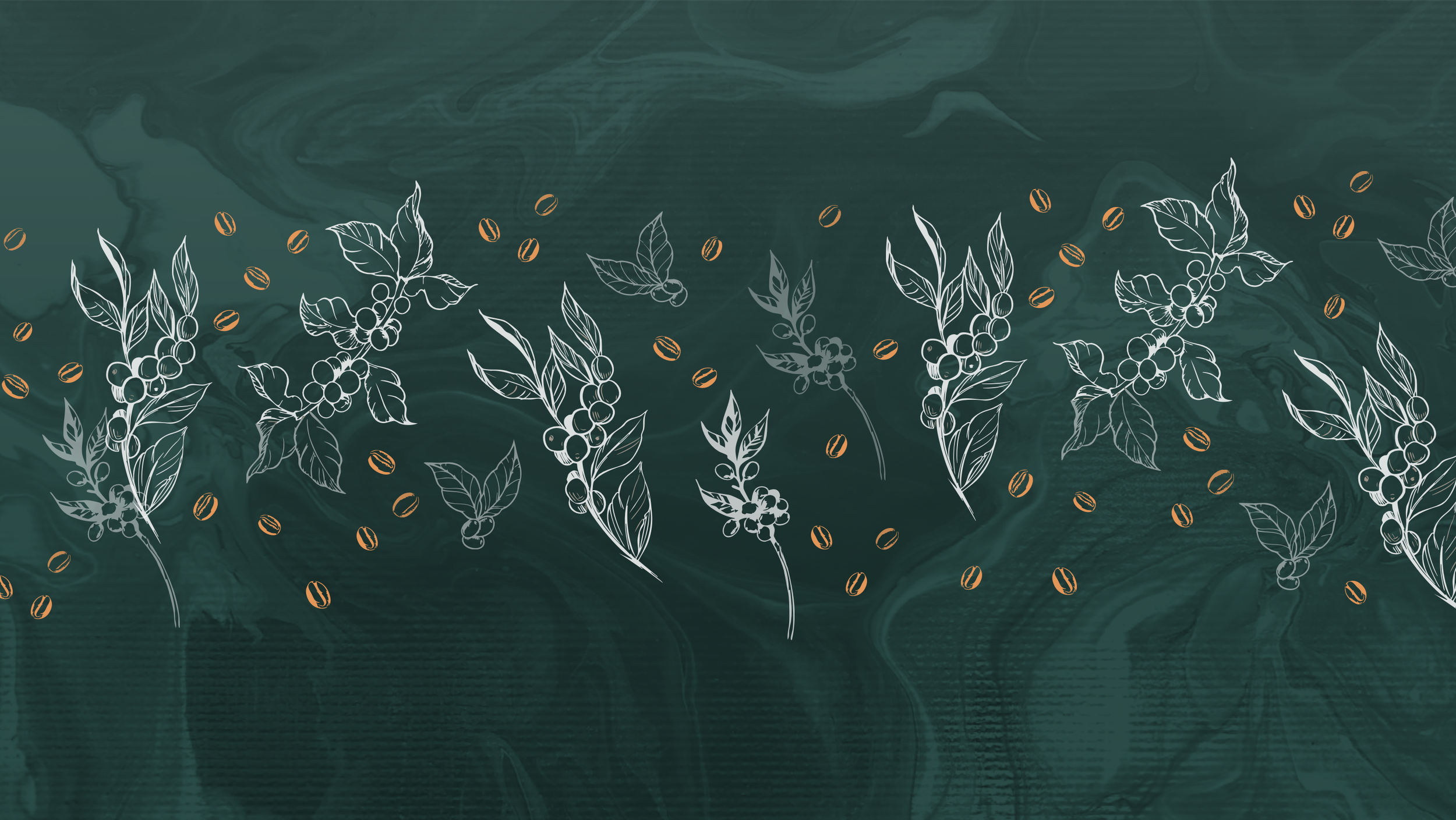
The concept was inspired by the product itself. I wanted to create an authentic, handcrafted expression by incorporating coffee directly into the design process. Coffee beans and coffee plants from the Karatina region of Kenya where one of the featured coffees originates were illustrated by hand. I also experimented with both ground and brewed coffee as creative materials, using them to produce organic textures and patterns that were later digitized and integrated into the final design.
The result was a distinctive visual identity that communicates both the origin of the product and the craftsmanship behind the coffee-roasting process in an artistic and abstract way.
The work was carried out when I worked at Bølgen Media AS
Mockups of design sketches
Final result
Easter Calendar for Jæren Kaffi Glede
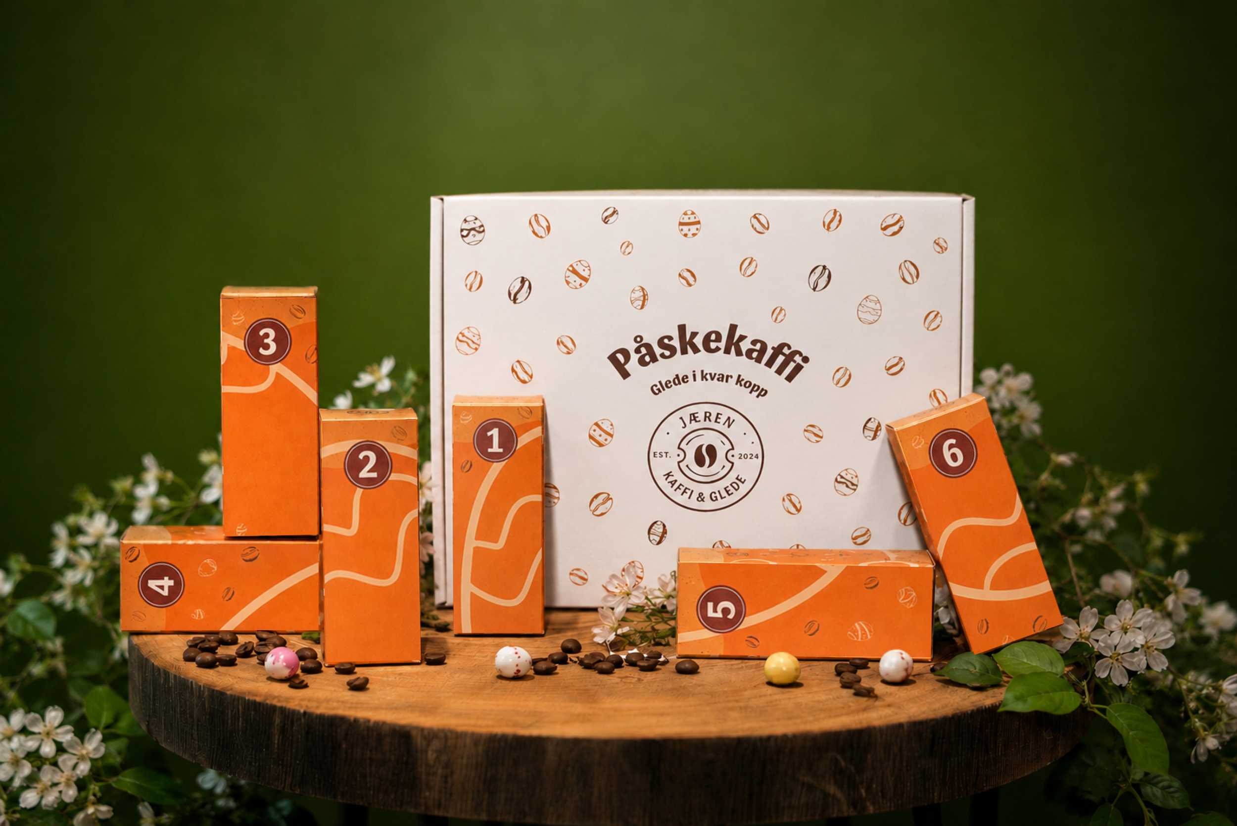
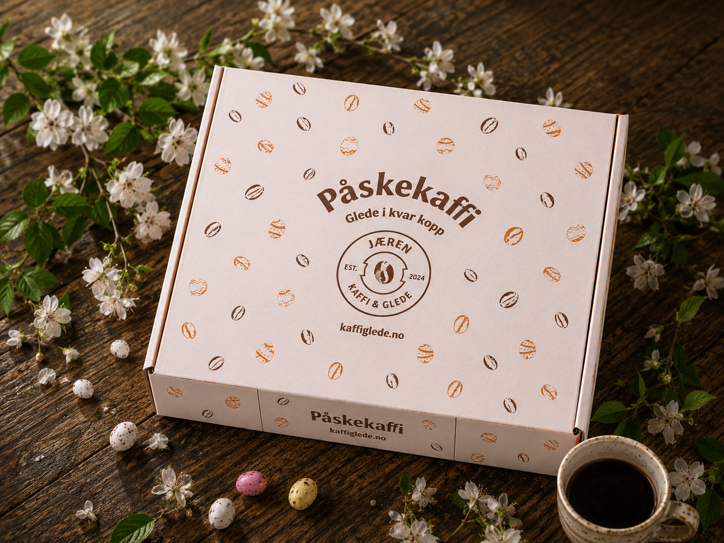
For Jæren Kaffi Glede’s Easter Coffee Calendar 2026, I developed the packaging design for a collection of eight coffee tins featuring coffees sourced from different regions around the world.
The project came with production constraints due to a limited budget and restriction to have only two print colors on the main packaging. They also wanted to have a design which is different from the previous Advent calendar. This led me to pursue a more minimalist design approach.
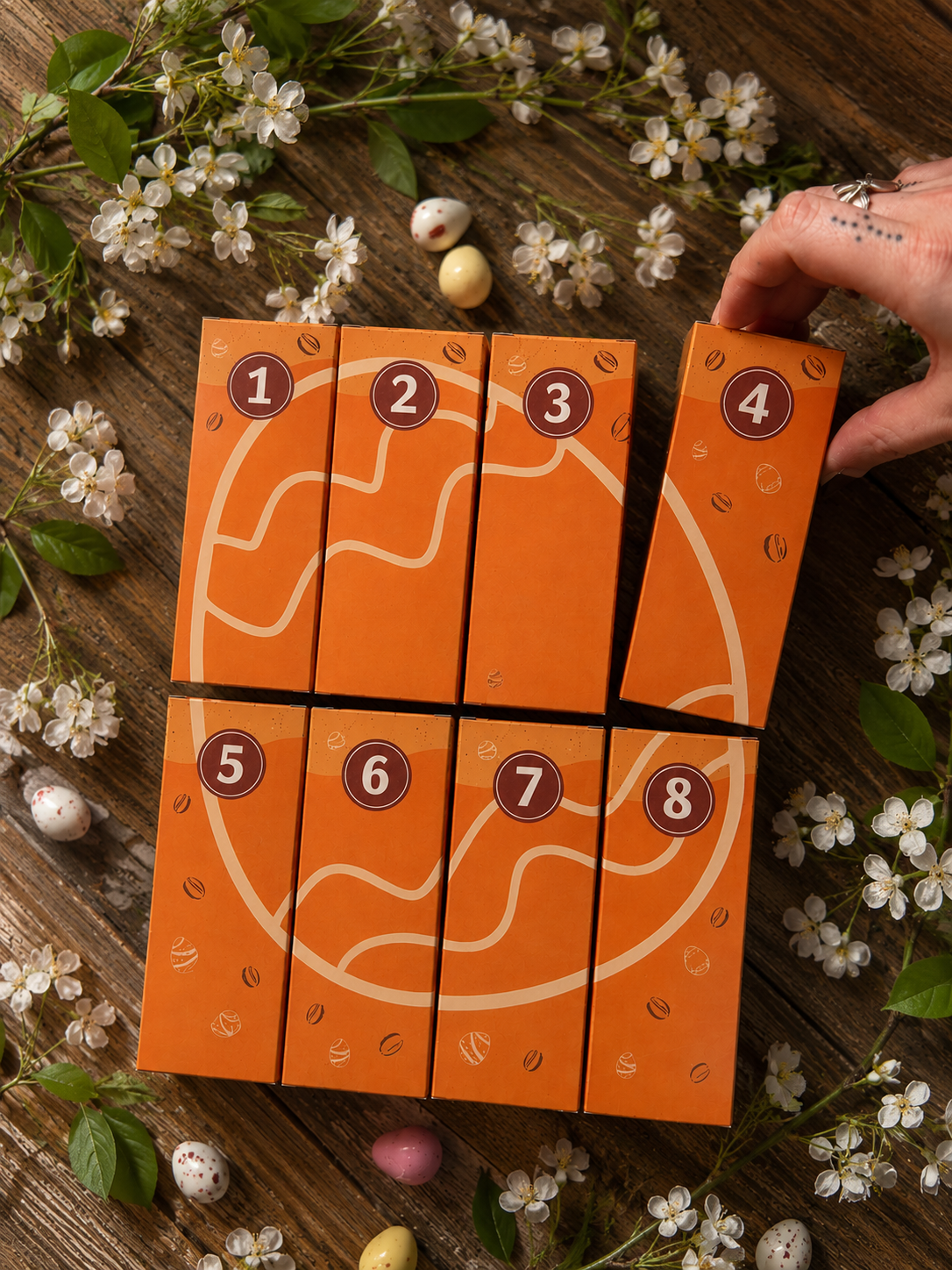
Building on illustrations I had created for earlier packaging projects, I combined coffee beans illustrations with the shape of an Easter egg as a key graphic element. This allowed me to create a visual connection between the product and the seasonal theme while maintaining a cohesive brand expression.
The goal was to create a playful and interactive design in which each packaging functions as an individual piece and separately, the artwork appears abstract but when arranged in the correct order, the eight boxes form a complete illustration and the full image is revealed.
This approach added an extra dimension to the product experience and encouraged customers to engage with the packaging in a more interactive and exploratory way.
Final result