Fjord Xplore
Visual Identity
Design of flyers
& photos
Visual identity
FjordXplore was founded with a clear ambition: to elevate the way visitors experience the Norwegian fjords. Rather than competing as another sightseeing operator, the company set out to create a premium experience brand centred around private fjord cruises, tailor-made adventures and exclusive charter experiences throughout the Stavanger region.
I was responsible for developing the company's visual identity from the ground up, including brand strategy, naming exploration, logo design, colour palette, promotional material and photography.
Before any visual concepts were created, I immersed myself in the company's vision, values and long-term ambitions. The objective was to build a brand that felt modern, energetic and refined while appealing to a broad audience from international travellers and families to corporate groups and private event organisers.
One of the key strategic challenges was repositioning the company from a value-oriented tourist operator into a premium experience brand. Every design decision was guided by that ambition, ensuring the identity communicated exclusivity, quality and a sense of adventure from the very first interaction. Rather than simply creating a logo, the project focused on building a flexible visual identity capable of growing alongside the business as it establishes itself within the premium tourism market.
Color palette
Name
Design av flyers
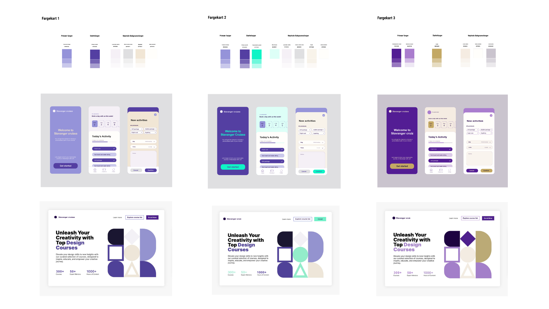
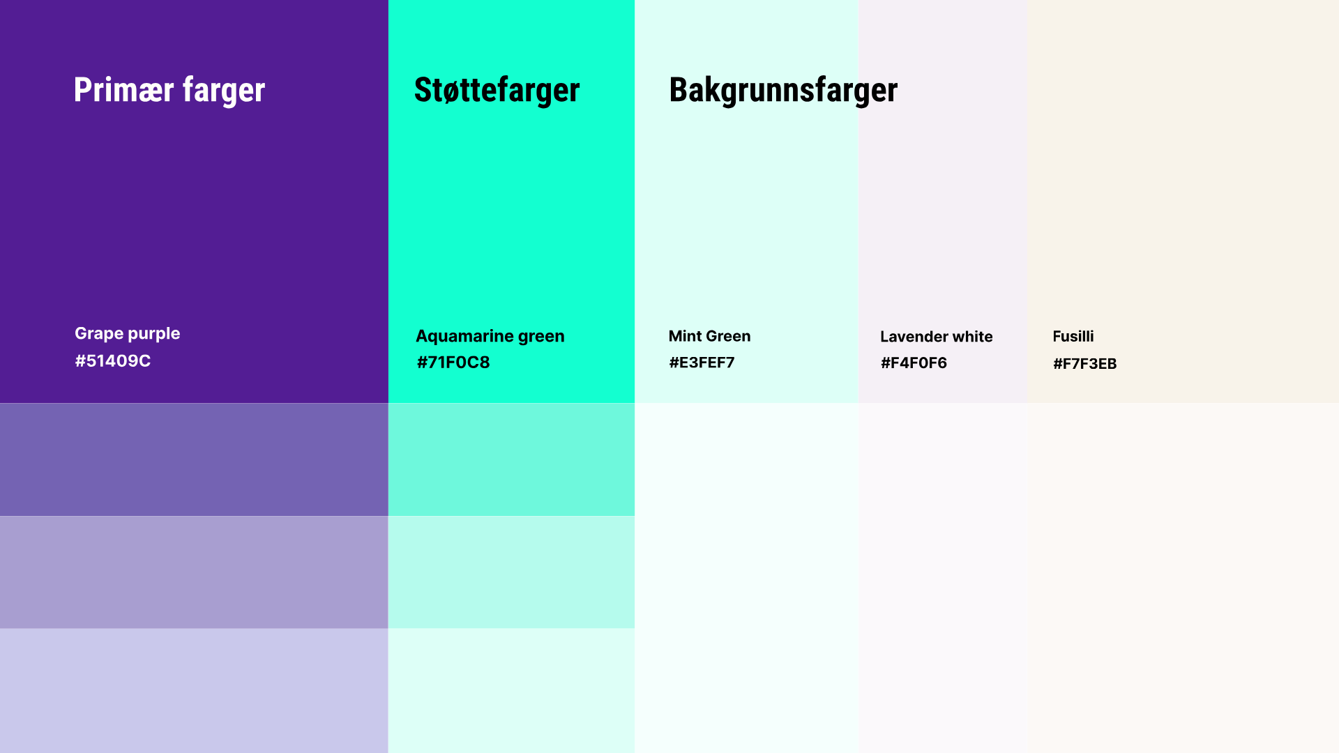
Colour became one of the strongest tools for shaping the brand's personality.
Instead of following the predictable blue palette commonly associated with tourism and maritime businesses, I explored three distinct colour directions before arriving at a rich, deep purple as the primary brand colour. Purple communicates sophistication, creativity and exclusivity while giving FjordXplore a distinctive presence in a highly competitive market. It immediately separates the brand from traditional fjord operators and reinforces its premium positioning.
To balance the darker primary colour, I introduced an aqua-green secondary tone inspired by the Norwegian fjords and coastal landscape. It injects freshness, movement and a sense of exploration while creating visual contrast throughout the identity system. Throughout the process, principles of colour theory, accessibility and digital usability guided every decision, resulting in a palette that is both aesthetically distinctive and highly functional across print and digital applications.
I explored a range of naming concepts designed to better communicate the company's vision, positioning and long-term ambitions. Among the proposed directions, FjordXplore emerged as the strongest options.
The name combines the iconic Norwegian fjords with the idea of exploration, capturing the essence of discovery, adventure and experience-led travel. At the same time, it conveys flexibility and freedom while maintaining a modern, international and memorable character.
Designed to be both distinctive and easy to remember, FjordXplore provides the company with a name that stands out in a competitive tourism market while clearly reflecting the premium experiences the brand aims to offer.
Logo process
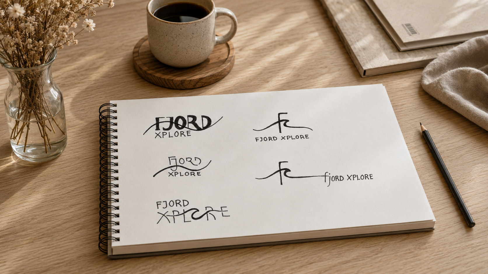
I explored ways of integrating the wave directly into the logotype, creating a stronger relationship between typography and symbol. The ambition was to create a cleaner, more contemporary identity where every element worked together as one cohesive mark.
Through an iterative sketching process, I explored multiple concepts that balanced readability, personality and scalability across digital and printed applications. Every iteration was evaluated not only for aesthetics, but for how effectively it communicated the brand's premium positioning.
Although the final direction retained more of the client's original logo than initially envisioned due to budget considerations, the design exploration established a clear strategic direction for how the visual identity can evolve as the company continues to grow.
Name
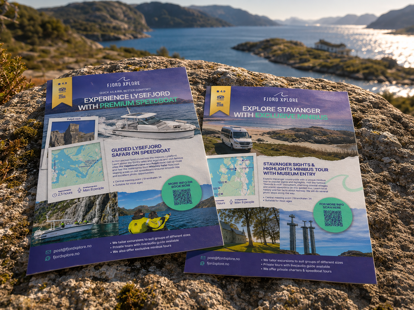
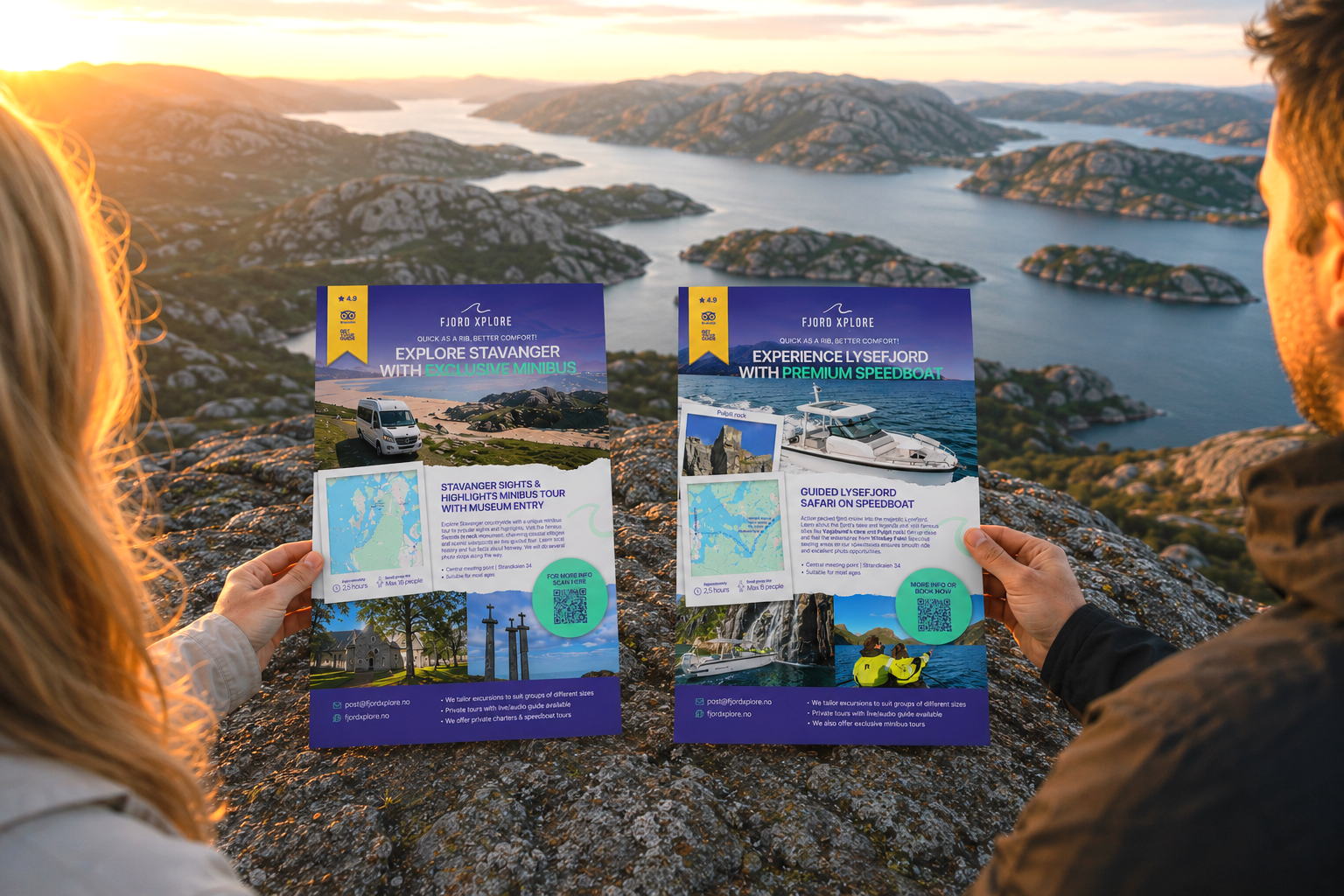
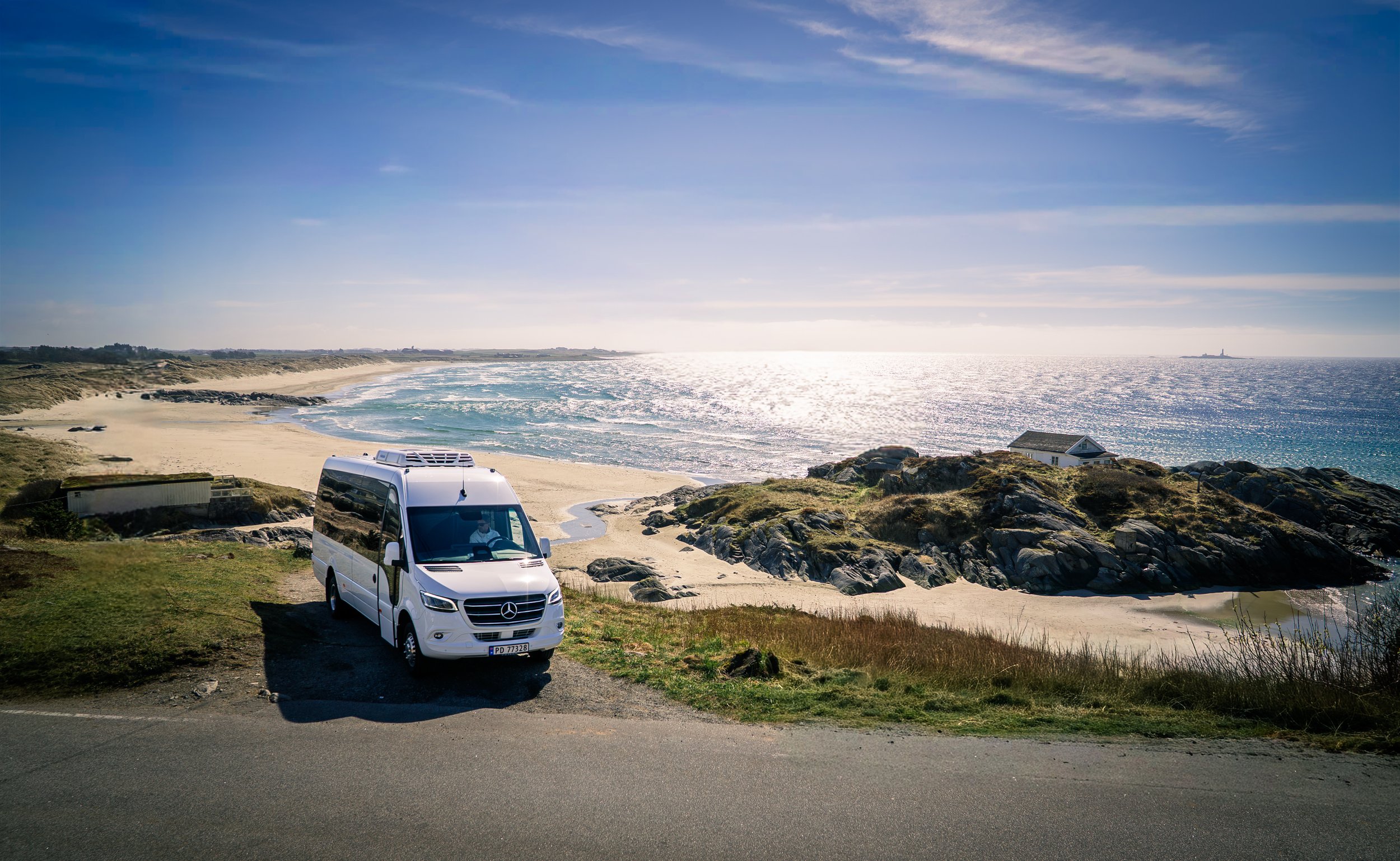
I designed this flyers for the company’s while working for Bølgen Media AS. The flyers is for two main experiences which is guided bus and boat tours. I also took photos for them used throughout the marketing materials and some of them are on their website too.