Bølgen Media
Visual identity
Rebranding for
Bølgen Media
When I started working at Bølgen Media, I was given the responsibility of further developing and refreshing the company’s visual identity. The goal was to create a clearer and more cohesive brand that better reflected the company’s personality, values, and position in the market.
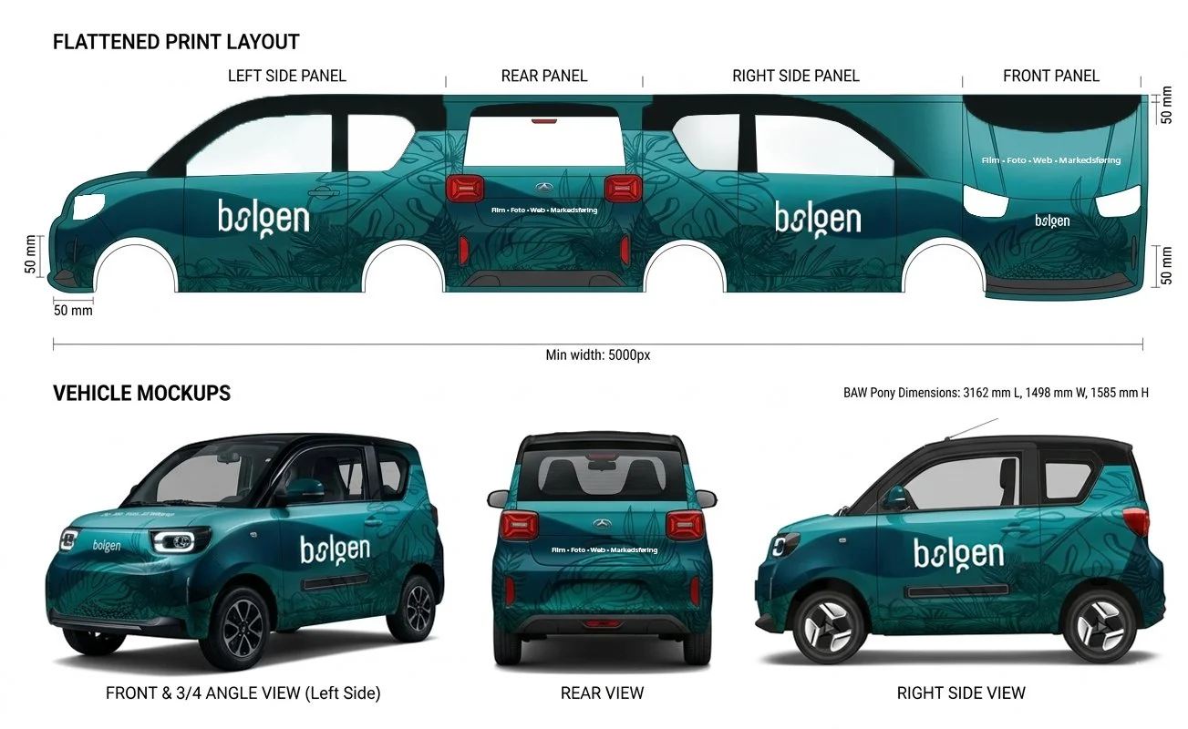
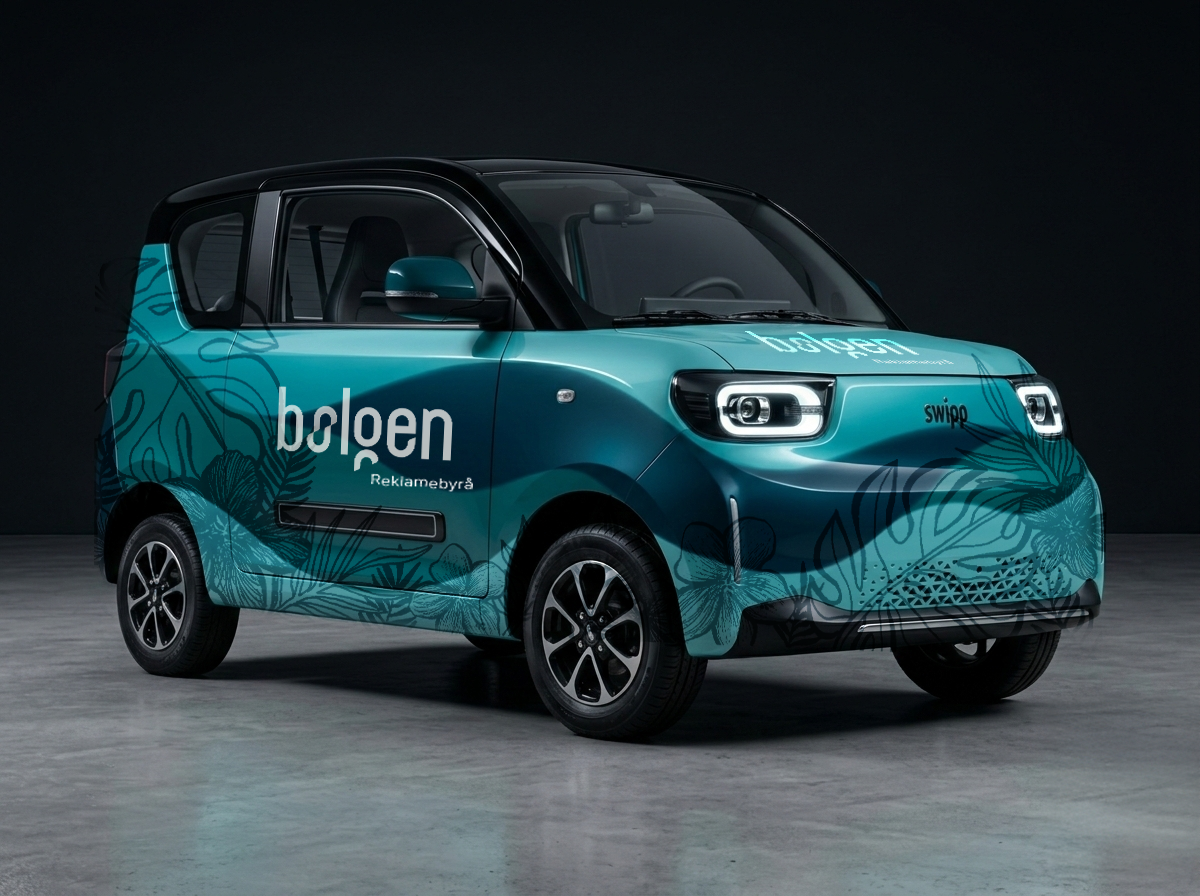
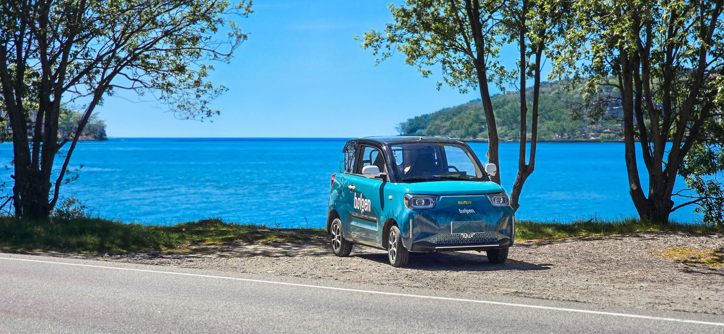
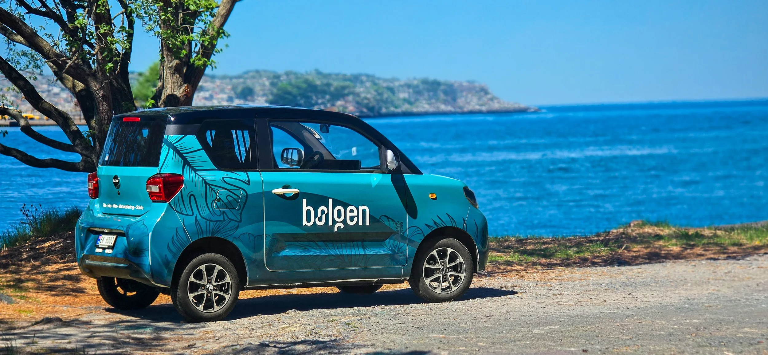
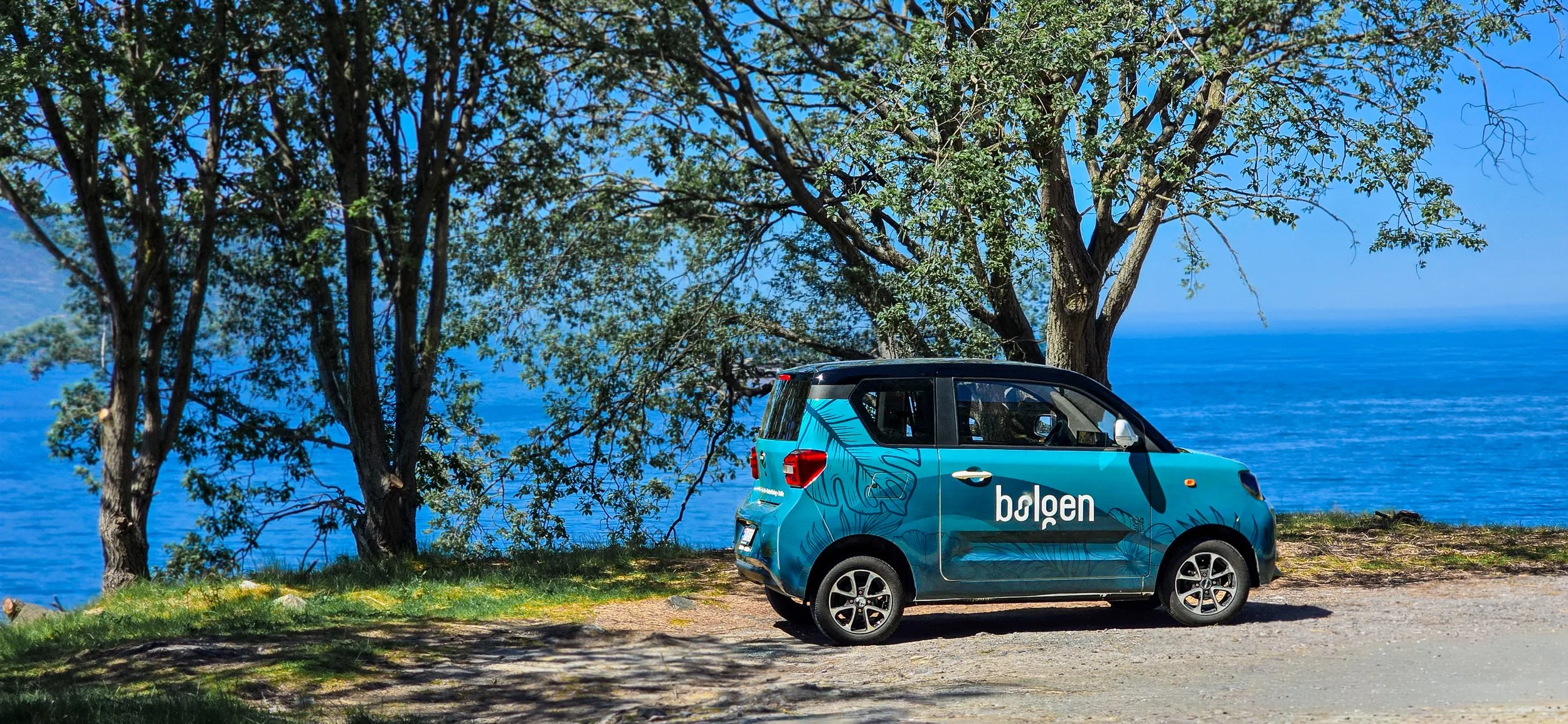
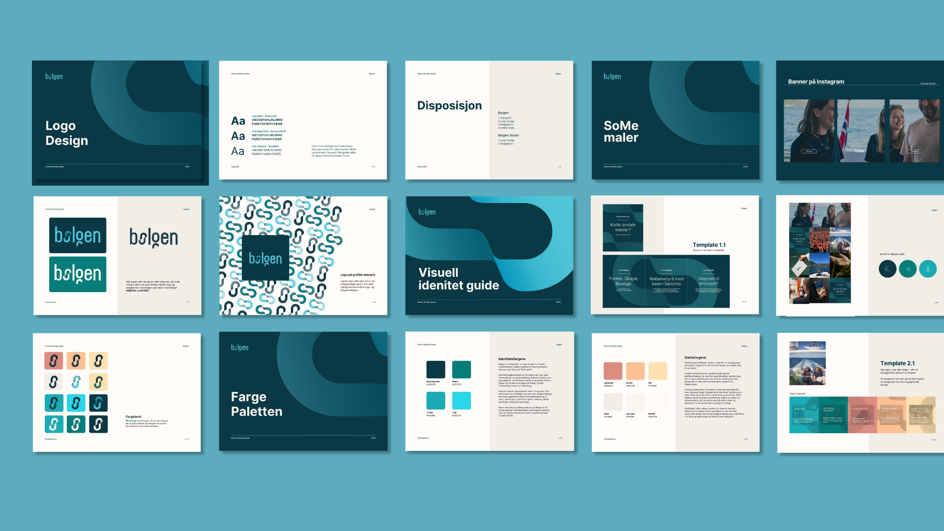
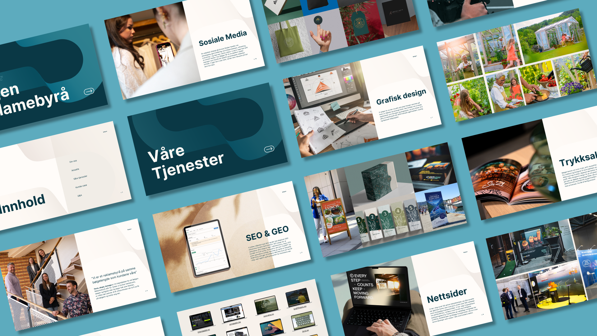
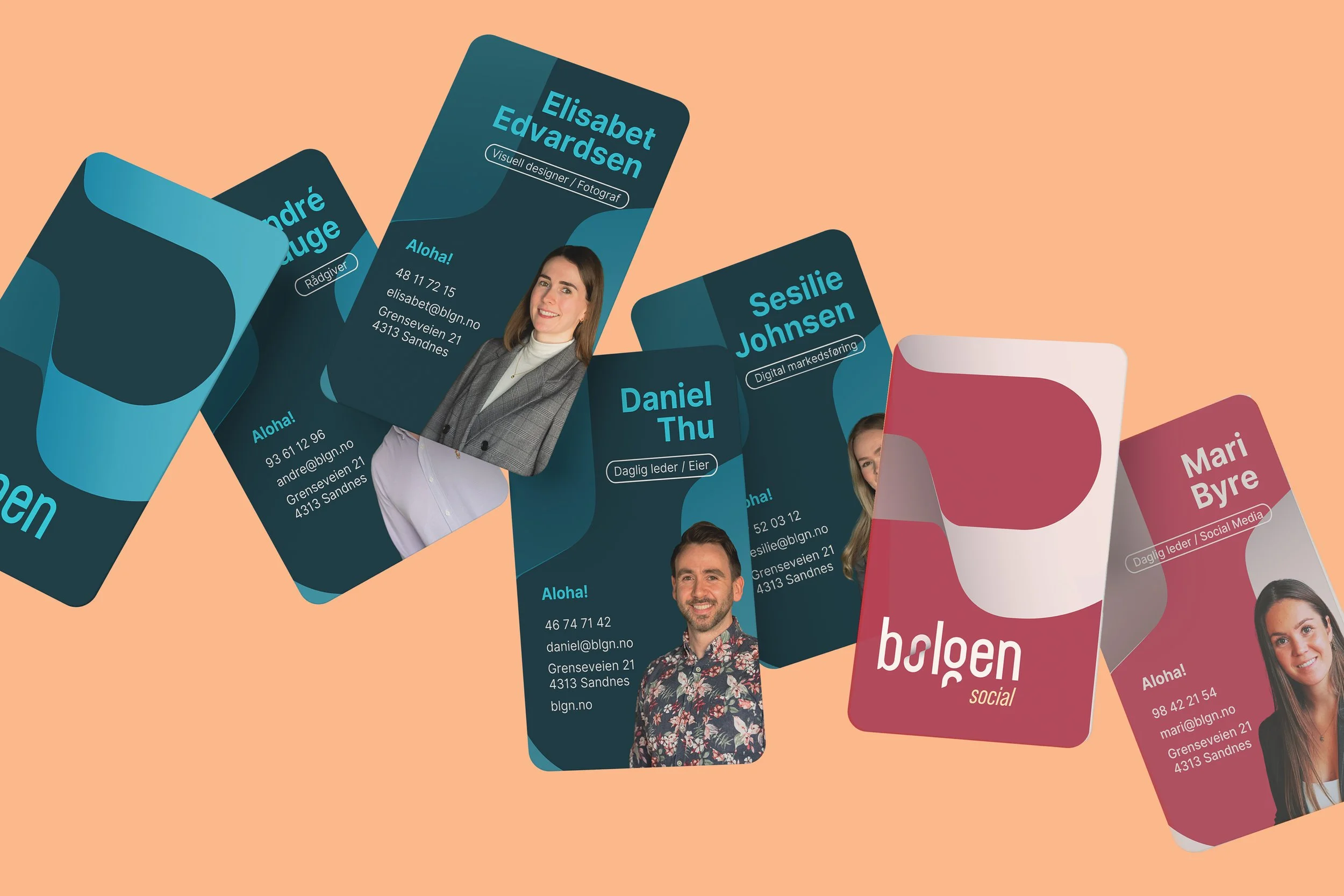
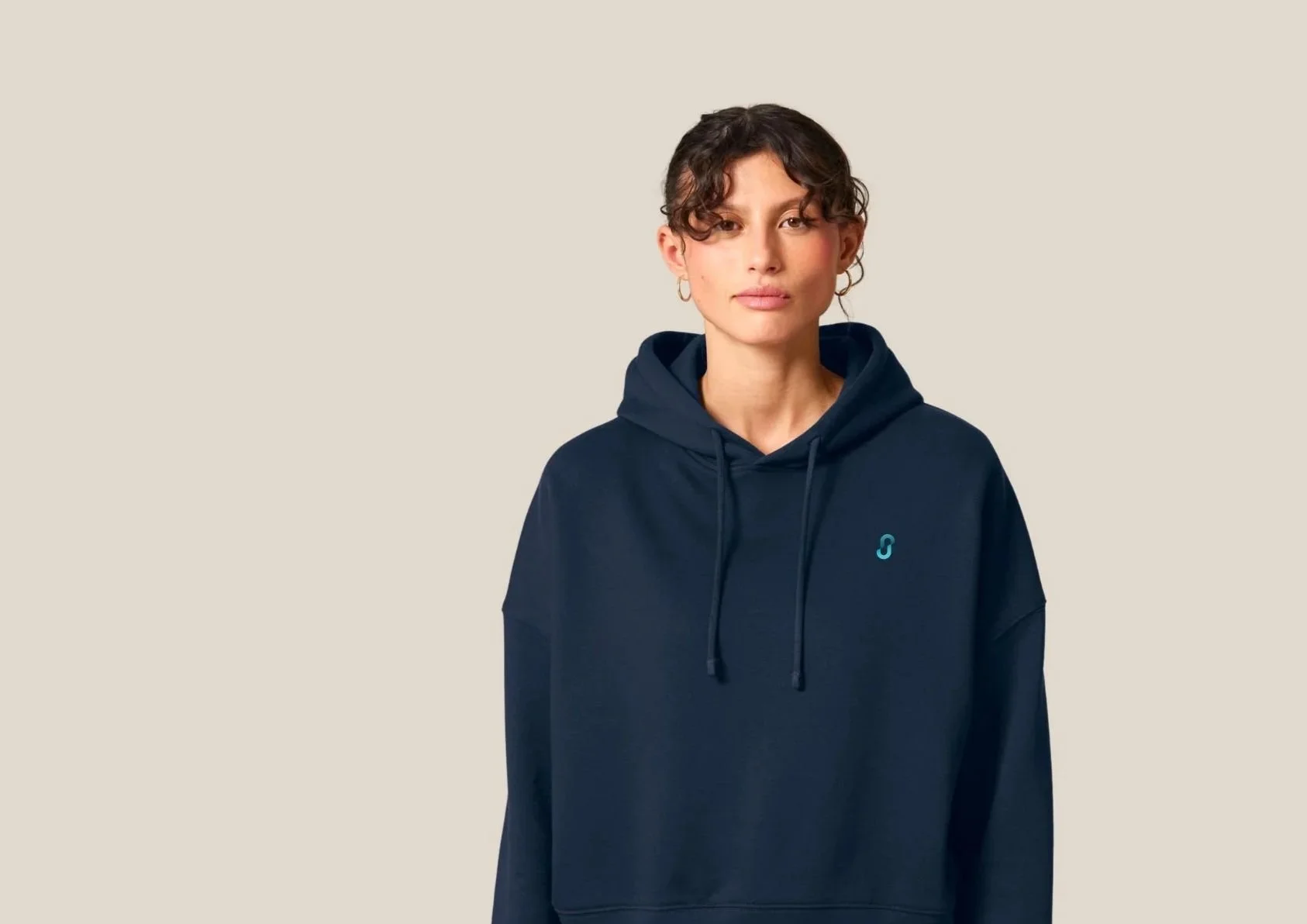
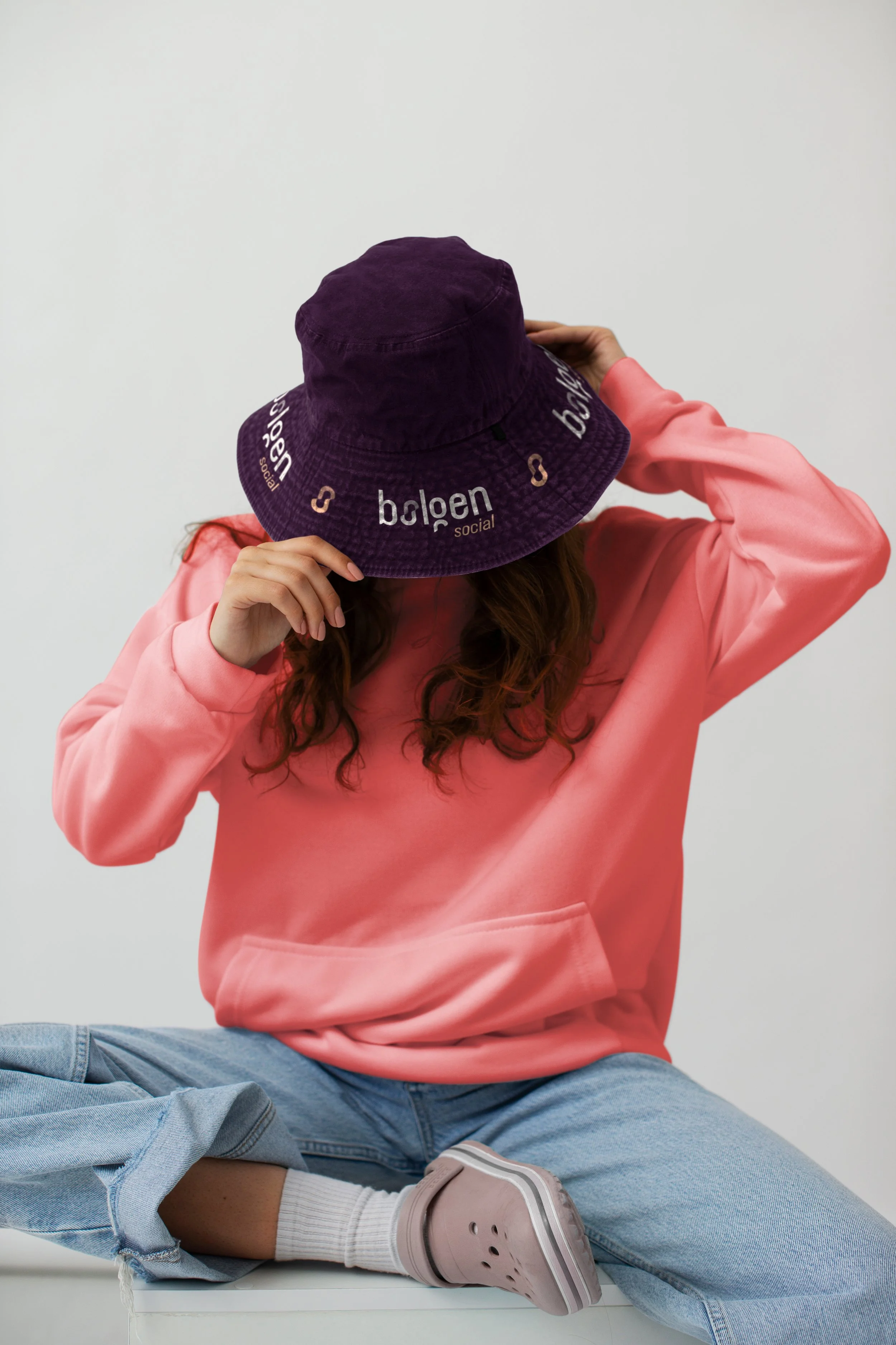
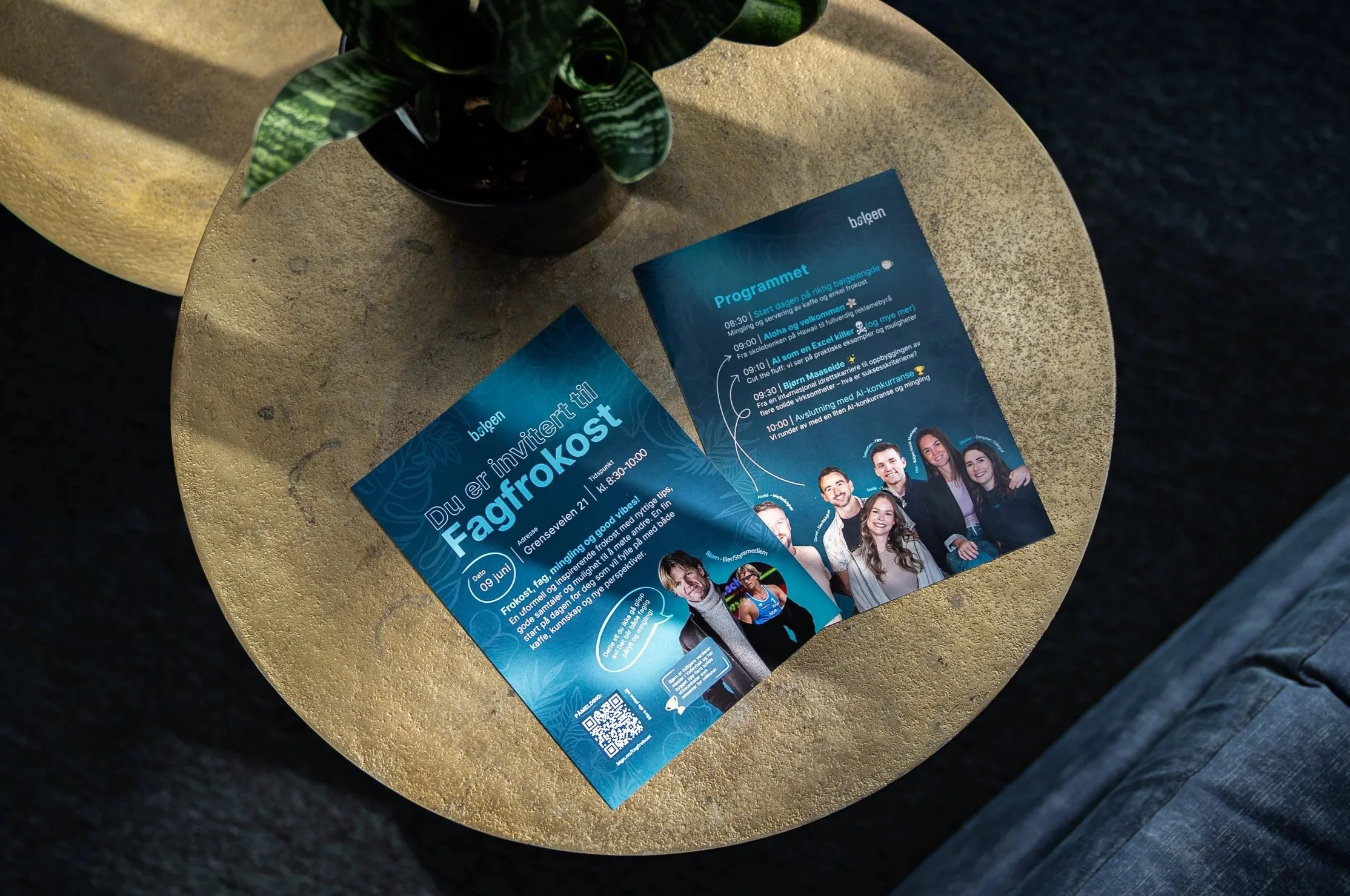
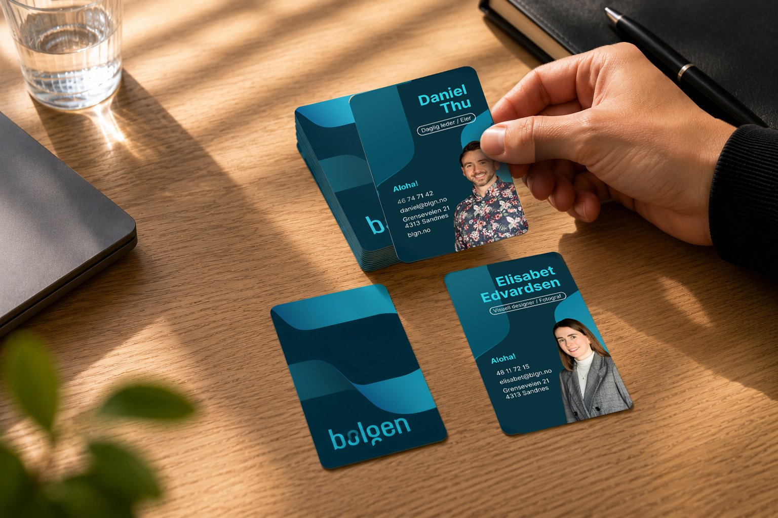
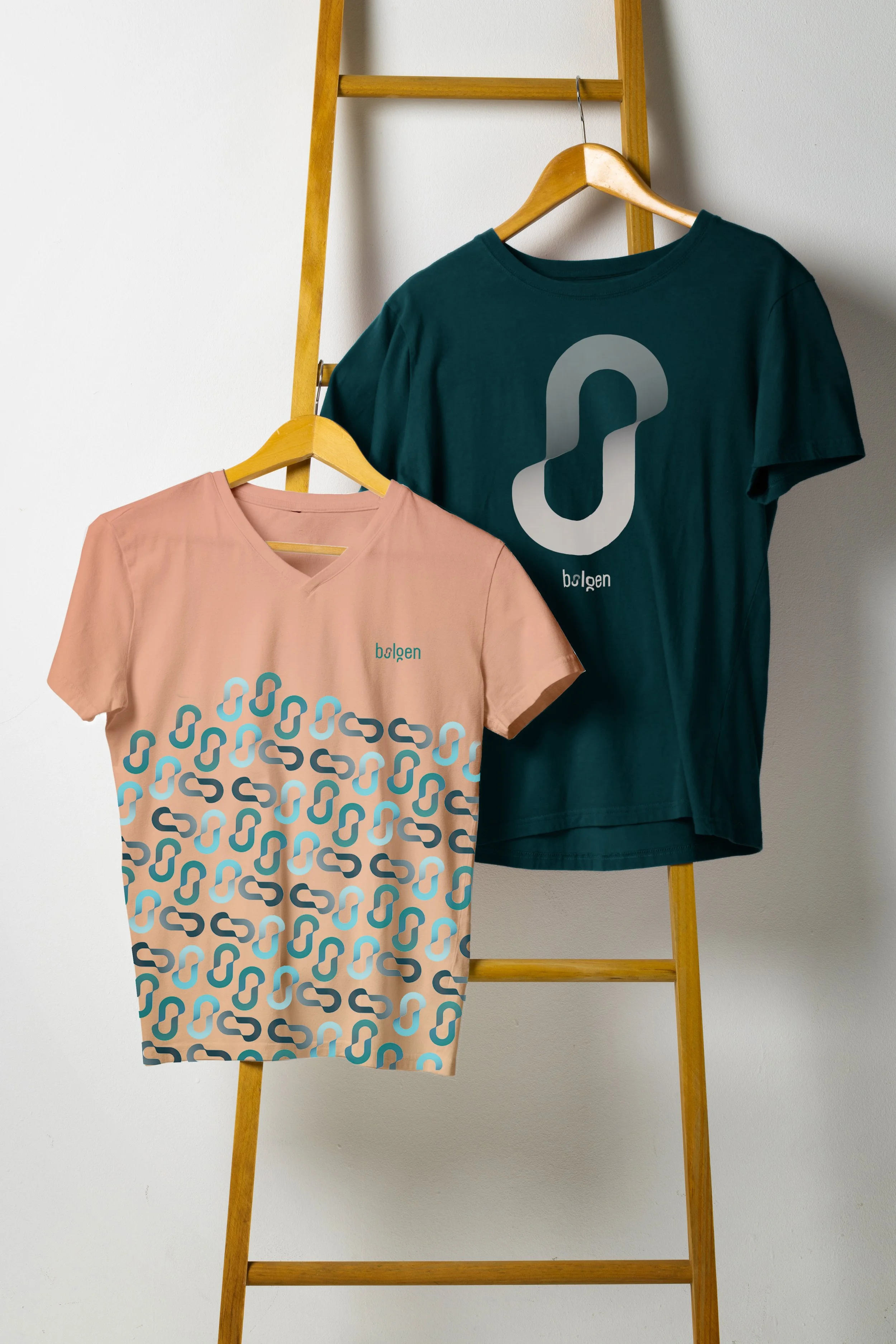
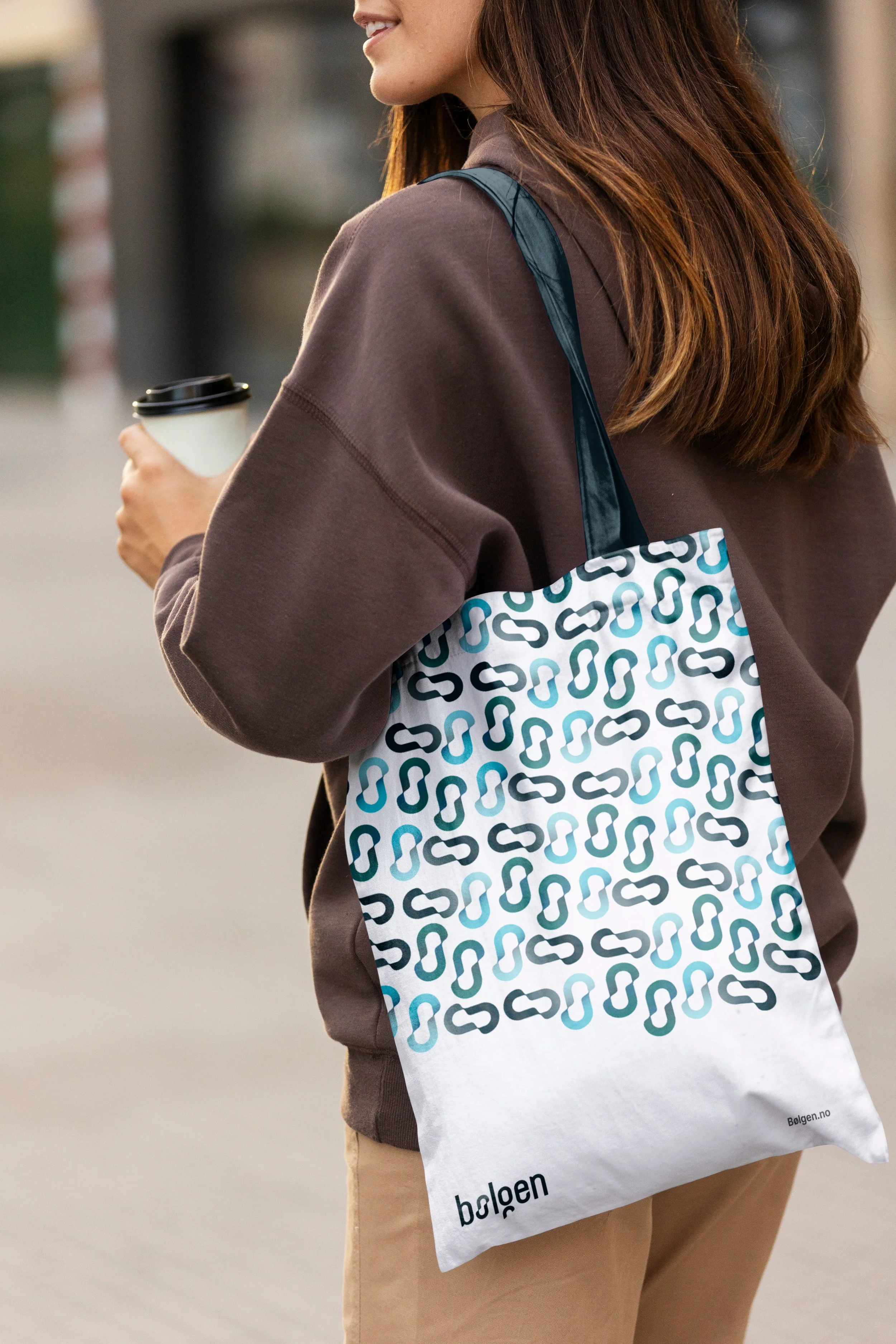
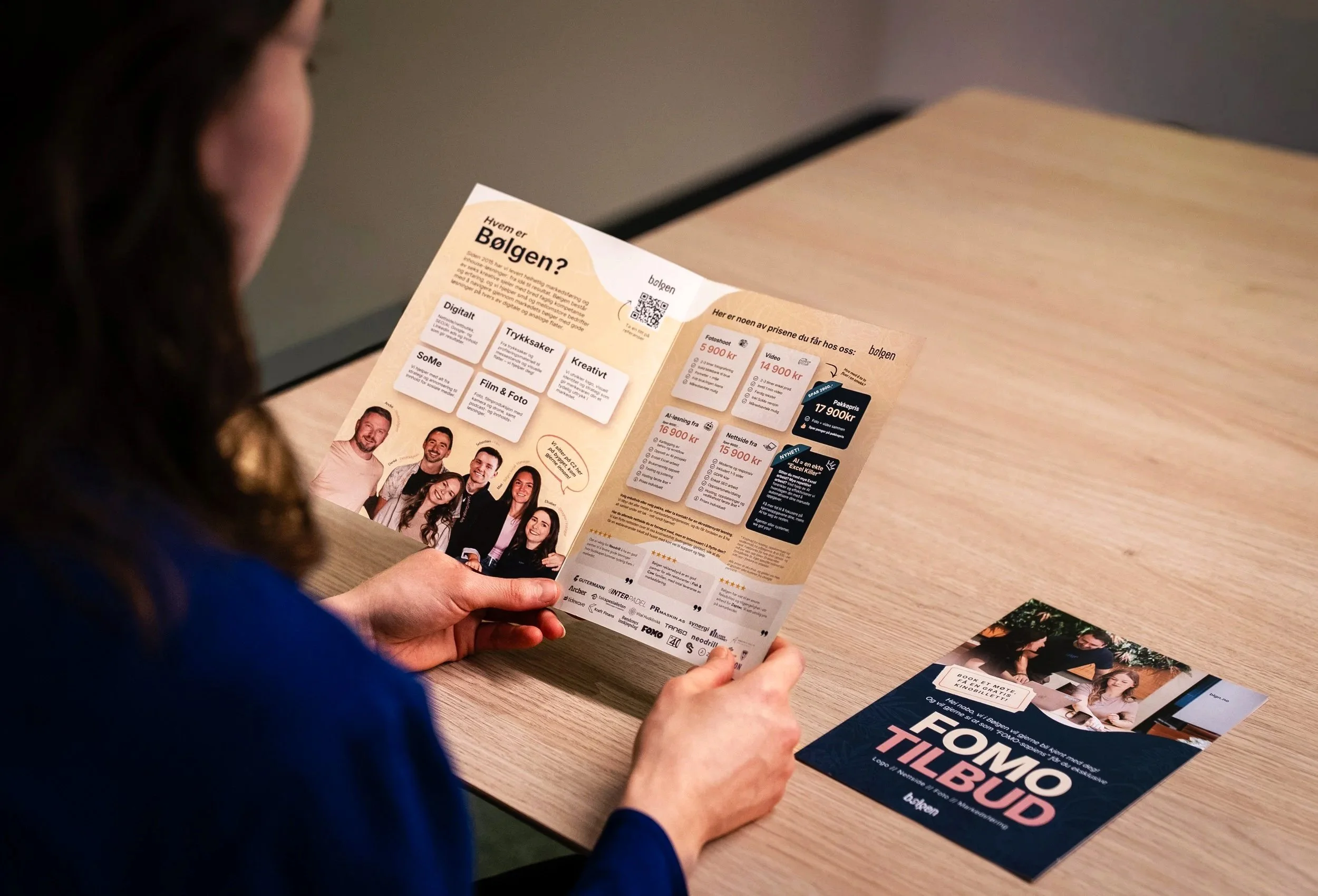
The project involved developing a new visual profile including graphic elements, printed materials, presentation templates, social media branding, merchandise, created the visual design for our vehicle wrap, typography, and a refined color palette. I also contributed to the development of the logo in close collaboration with a colleague.
A key part of the process was understanding the foundation of the Bølgen brand. The company draws its inspiration from the ocean, surf culture, and the power of waves. Waves symbolise continuous movement, determination, and the ability to shape and influence their surroundings that closely align with the company’s approach to marketing and creative work: shape, create and move. At the same time, Bølgen aims to stand out by combining these influences with the values of the “Aloha Spirit,” creating a brand that feels both energetic and welcoming while maintaining a classic and elegant expression.
My goal was to translate these qualities into a visual language though colors and graphic shapes and elements that felt authentic to the brand.
Color palette
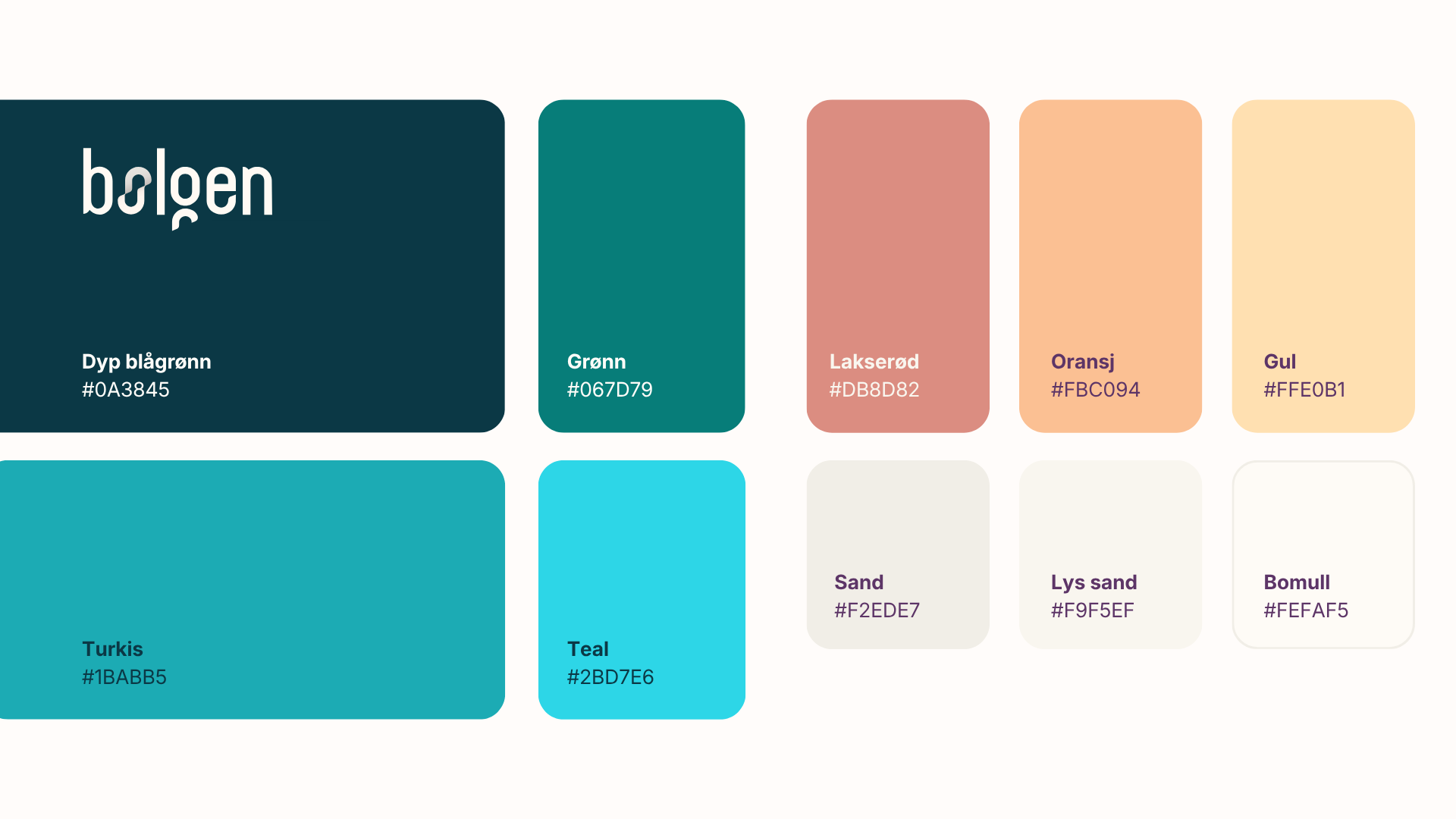
The color palette was developed based on Bølgen’s identity and values, drawing inspiration from the ocean, surf culture, and the positive energy associated with the Aloha Spirit. The goal was to create a visual expression that balances professionalism and credibility with creativity, movement, and personality.
The main color for Bølgen is blue-green tones form the foundation of the identity and were chosen to communicate stability, reliability, and a strong connection to the sea. Turquoise shades add energy, freshness, and a creative character, while warm sand tones create balance and contribute a more human and approachable feel. As a contrast, I introduced a set of vibrant secondary colors: orange, coral, and yellow. Inspired by Hawaiian sunrises, these colors increase visibility, work effectively in call-to-action elements, and are primarily used in smaller details, and graphic accents. At the same time, they help emphasize Bølgen’s creative, inclusive, and energetic personality.
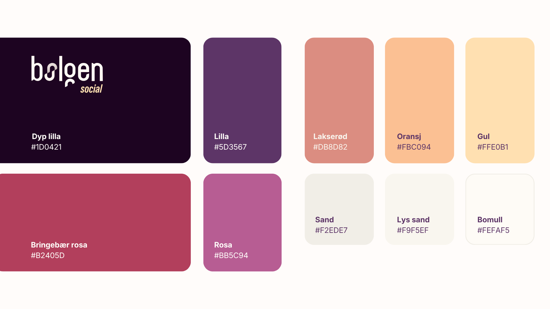
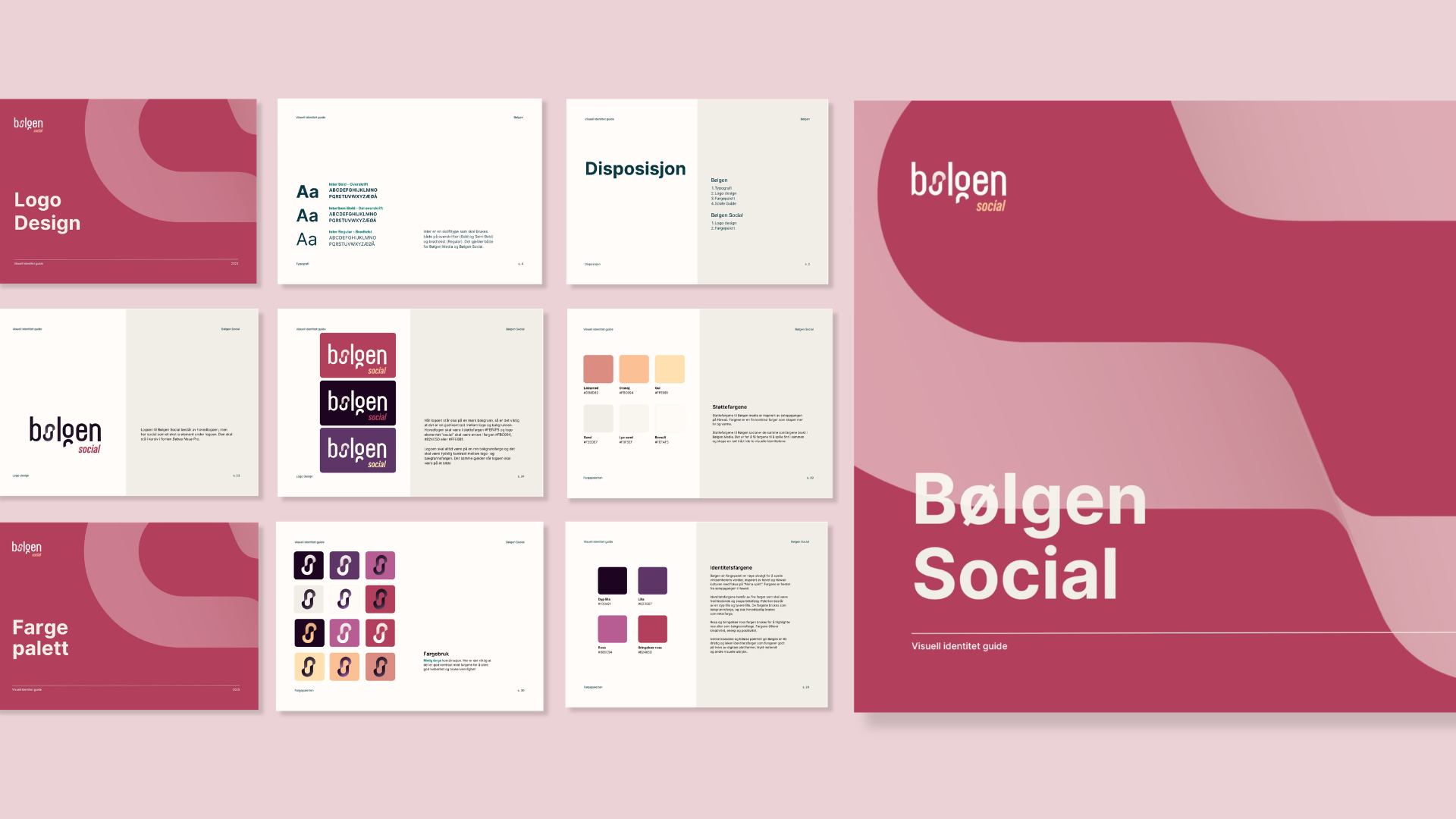
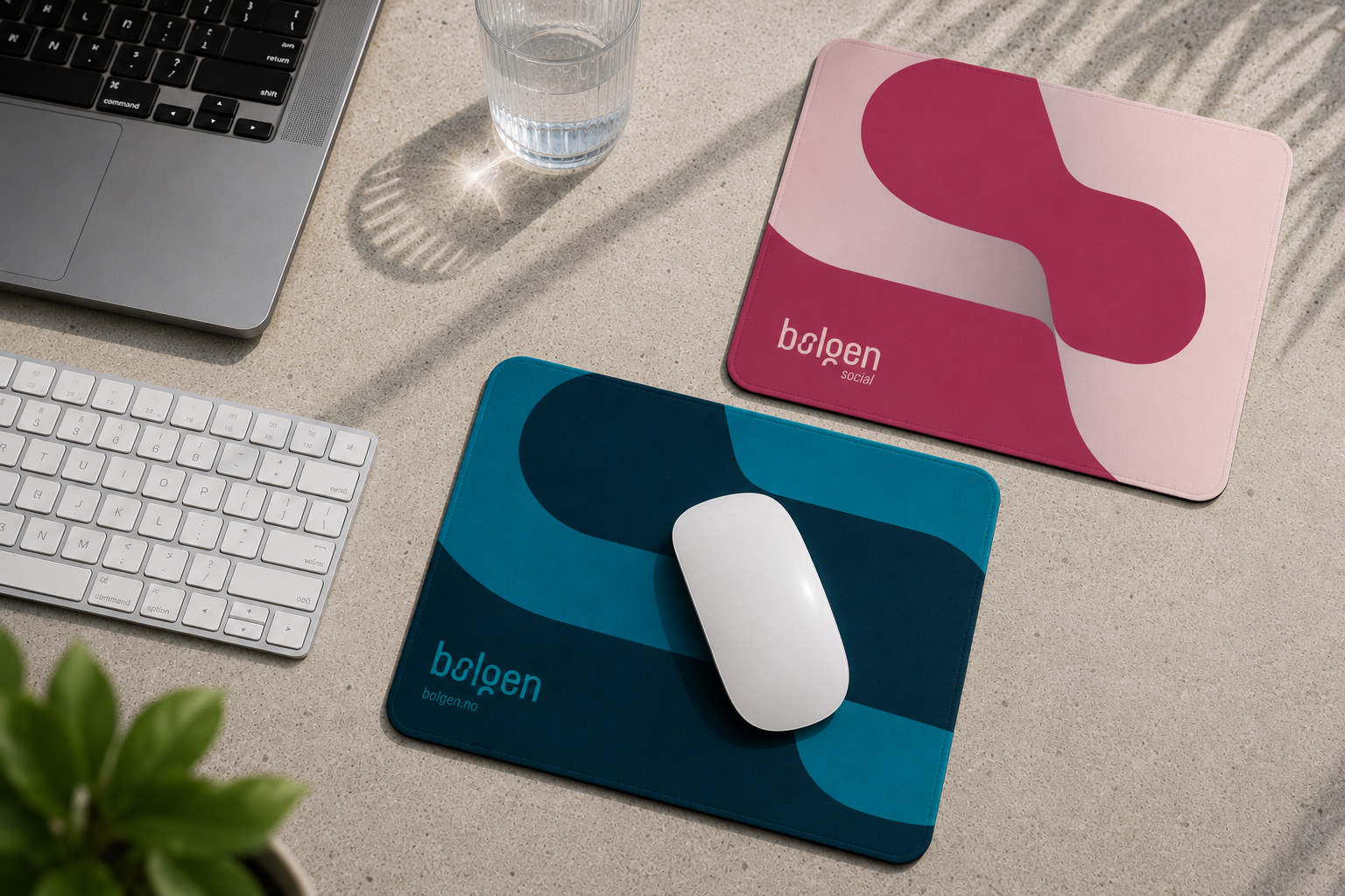
The secondary color palette also creates a visual connection between Bølgen and its subsidiary, Bølgen Social, the company’s social media division. The objective was to establish a clear distinction between the two brands while maintaining a red thread between them.
To achieve this, I carried forward the same design principles, typography, and overall visual language from Bølgen, creating a strong visual connection between the brands. At the same time, each identity was given its own distinct personality through a dedicated color palette. For Bølgen Social, the palette was inspired by the colors of a Hawaiian sunset, featuring shades of purple, pink, and raspberry that bring energy, creativity, and a more social and expressive character. The result is a flexible design system that allows both brands to maintain their individuality while remaining clearly connected.
During the development of the palette, I worked consciously with color theory, contrast, and accessibility standards to ensure strong readability and flexibility across both digital and print applications. The goal was to create a functional visual identity system that strengthens brand recognition and performs consistently across all touchpoints.
The final color choices are therefore the result of both strategic and aesthetic considerations, combining Bølgen’s connection to the ocean with the need for a more distinctive, recognizable, and contemporary visual identity.
Visual identity
guide to Bølgen
Merchandise
Vehicle wrap design
for Bølg